WineSavour | Virtual Wine Shop
UX/UI Research & Design, Branding, Identity
WineSavour is an online wine boutique built for avid wine connoisseurs. WineSavour’s user base knows what they want, they don’t need suggestions aligned with their taste, they need an avenue to shop smart—filtering a list of preferred varietals and regions with a savvy Smart Shop tool and a beautiful, high-end minimal interface.
My Role
Full-stack UI/UX, branding & identity
Tools
Figma, Illustrator, Photoshop, Maze, Zoom, Miro
Introduction & Methodologies
HMW: How might we optimize the wine selection process, in order to produce an ideal wine list that users are excited about?
Research
Competitor Research
User Surveys
A/B Tests
User Interviews
Synthesis
Affinity Mapping
Research Summary
Personas
Deliverables
User Flows
Wireframes
Brand & Style Guide
HiFi Prototype
Testing
Moderated
Unmoderated
Guerilla
DESIGN PROCESS | DEFINING USERS
Persona
The Collector is a fusion of characteristics and qualities collected from data produced in user surveys, interviews and a series of A/B testing with target users.
DESIGN PROCESS | BRANDING & IDENTITYStyle Guide
WineSavour is a modern, sophisticated online boutique with a blend of serif and sans-serif typography. The color palette is assembled from vineyard landscapes during harvest—a symbol of success and new growth; a celebratory winemaking event. UI elements are clean and minimal, using sharp corners and high contrast for a sophisticated look and feel.
DESIGN PROCESS | UNDERSTANDING COMPETITION
Competitor Research
Looking into 3 top competitors, I needed to identify their strategies while customers are shopping, as well as the check out phase, in order to find opportunities to test, and ultimately, improve. Although I looked into the purchasing user flow for all three competitors, I decided to highlight the List View screens below.
Competitor #1
Pain Points
Red line item creates a dark pattern. On first impression, the dollar amount saved appears to be the bottle price.
Must make an account to continue.
The voucher / promotion wasn’t applied like advertised.
Success
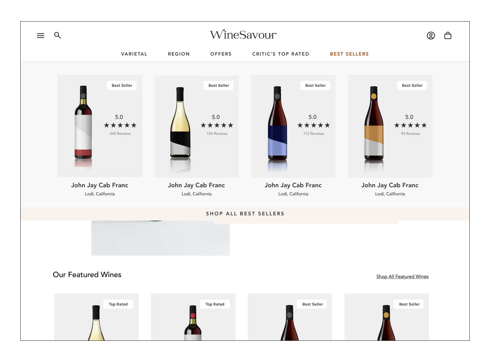
There is a clear sense of what wines are popular.
Wine imagery in context.
Competitor #2
Pain Points
The wine critic scores and abbreviations seem somewhat cryptic and confusing.
Wine labels on the browsing page seems to be redundant next to the title.
There are only 3 items visible at once.
Success
Clear estimate when each bottle can ship.
A Checkout overlay feels less of a “burden” than a full screen.
Competitor #3
Pain Points
Clicking “Add to Cart” sends the user to a new screen to sign in.
After signing in, the user is not returned to the preferred item, nor is it in the cart.
Sign up process is very long-winded.
Success
Grid view offers more products to view at once.
Good image quality of the bottles, much like a shelf or grocery store context.
Competitor Strategy = Design Opportunities
After comparing competitors, I identified areas to test to dig into how users prefer to browse, what metrics they want to see during wine comparison, and what is extraneous to their purchasing decisions.
Ratings & Reviews
All three competitors relied on a different review strategy: customer reviews, re-purchase rates and critic ratings. I’d like to find out which of these was preferable for WineSavour’s user base.
Information Architecture
WineSavour’s wine drinkers know what they want, but how do they prefer to find it? I’d like to discover a hierarchy of wine details to organize the browsing process with the most important details leading the search.
Simple Check Out
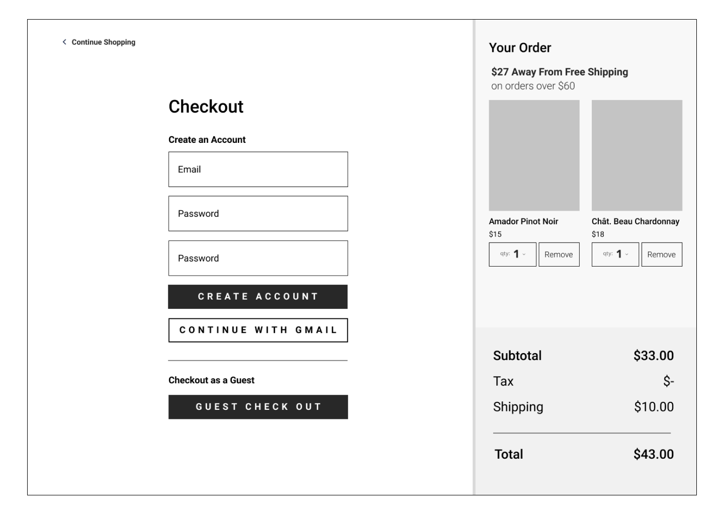
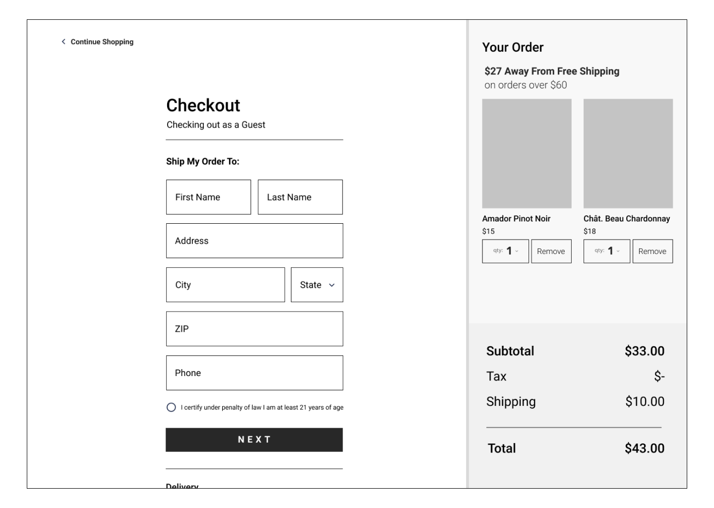
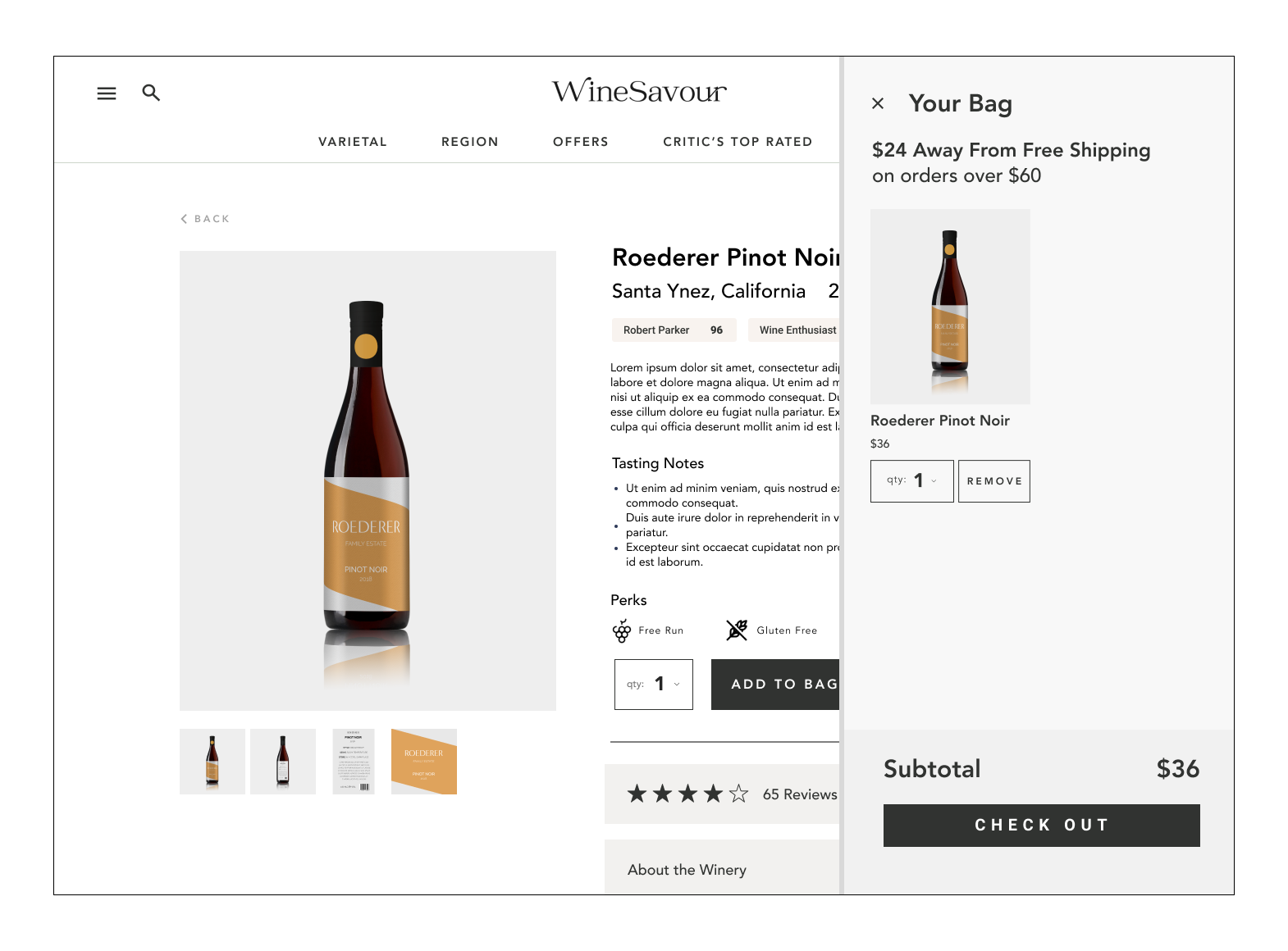
To avoid customers abandoning their carts due to long-winded and messy forms, a low-impact guest checkout should be optional, and should only collect must-have information.
DESING PROCESS | UNDERSTANDING USERS
Designing With Users
In this project, I wanted to focused on the concept of designing WITH users, rather than for them. This mindset allows people using the interface to find a place in the driver seat, and human-centered design becomes more integrated in the decision making process. To do this, I created a series of simple “games” for my interview participants to play in order to better understand their habits, actions and preferences through the wine shopping experience.
After diving into competitors and identifying opportunities for design solutions, I tested more users along side one-on-one interviews to gather data on how they would organize the browsing process.
Mapping the Wine Browsing Hierarchy
As a previous wine educator myself, I was a bit surprised by the low rankings of recommended pairings and winemaker (sorry to any winemaker reading this), but I suspect much of this may be because users are already well-aware of the recommended pairings for most wines they enjoy. Nevertheless, region and varietal are front running metrics.
Data from Four Test Scenarios
Test Scenario One
You recently discover an online wine shop and decide to purchase a few bottles of wine, where do you click to begin your search?
Insights: Users sort by varietal in stores, and at times rely on recommendations like “Best Sellers”. In general, wine connoisseurs already know what they prefer so an option like “Discover Favorites” of industry leaders failed. The brand making recommendations must have a reputation to establish trust. If not, users will trust their own discretion.
Test Scenario Two
In your search, you narrow down three bottles of wine, but need to make a final selection. Which of the following labels do you prefer?
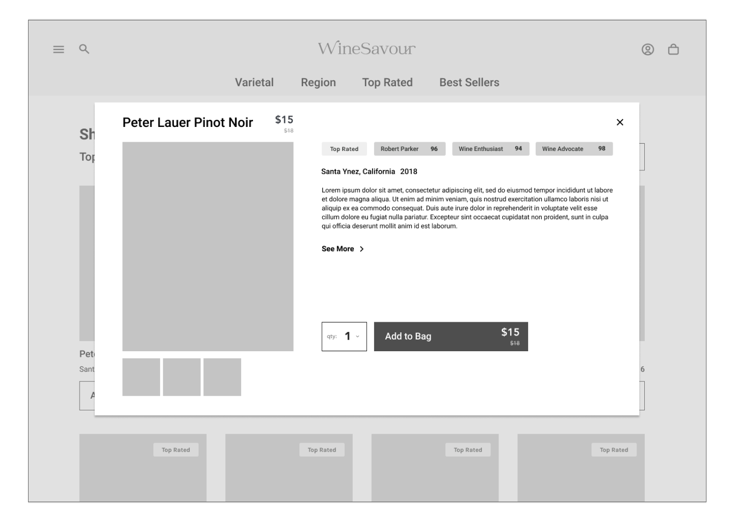
Insights: Users overwhelmingly choose Wine C, relying on expert peer review from notable organizations like Robert Parker. For this user base of experienced wine drinkers, repurchasing metrics from fellow wine drinkers is not valuable, because their opinion carries little weight when compared to the user’s own palette, opinions, and the opinions of top-tier wine critics.
Test Scenario Three
Imagine you are only allowed to know one detail about a bottle of wine before you purchase it. What would you prefer to know?
Insights: In Test Scenario One, a similar question was posed with a different outcome. If a customer is browsing for a wine, they will likely start with Varietal. However, the most valuable metric a user can know about a wine is the location, or Region, the wine is grown and produced. Changing the scenario slightly gives us insight into what users think versus what they actually do when selecting a wine.
Test Scenario Four
Selecting from the four scenarios, which wine do users prefer?
Insights: 100% of participants prefer a familiar varietal from a familiar region. Amazingly, most wine connoisseurs are no longer interested in exploring new wines, they simply know what they want and stick to it.
Synthesizing Interview Data
Interviews were conducted with 5 target users ranging in age from 26 - 44
DESIGN PROCESS | INFORMATION ARCHITECTUREUser Flow
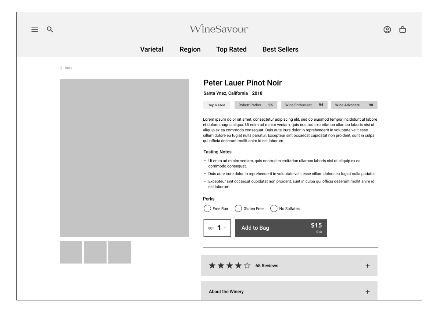
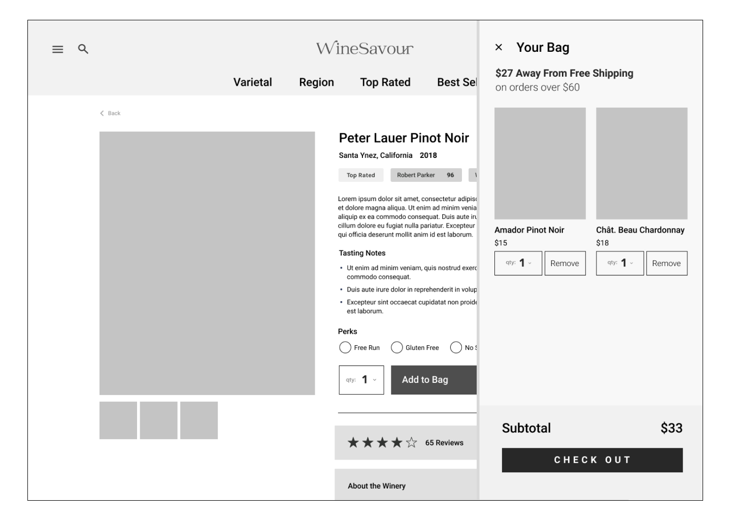
After gathering data from surveys, interviews and A/B tests, I began to design user flows. Keeping in mind the browsing hierarchy (mapped above) and creating an outline for a low-impact check out, a system of overlays with minimal inputs. Users with 100% agreement opted for a guest check out with a “continue with gmail” button to expedite the input process.
*click on the User Flow to expand.
Sketching & Ideation
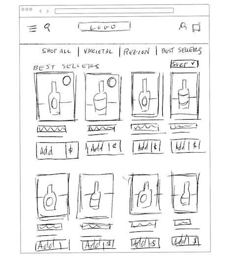
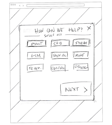
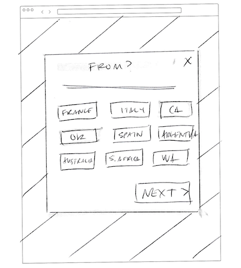
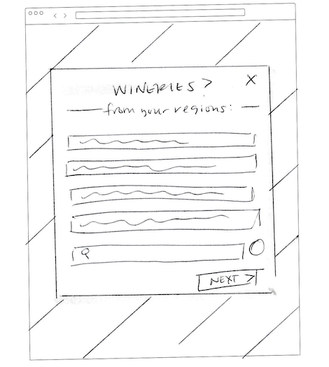
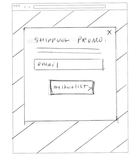
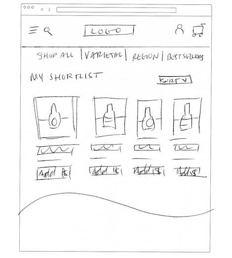
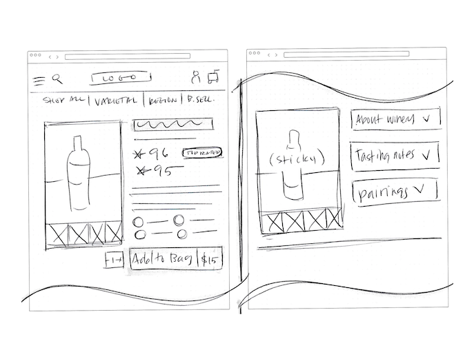
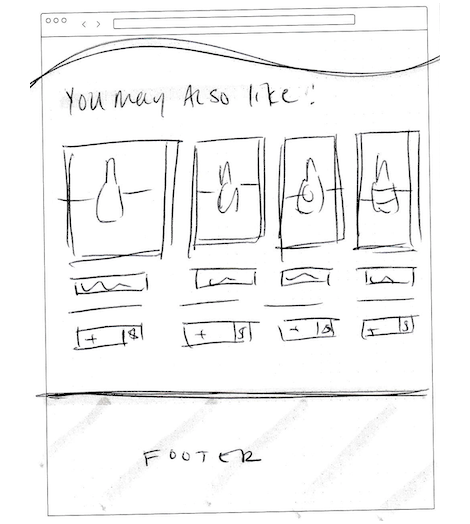
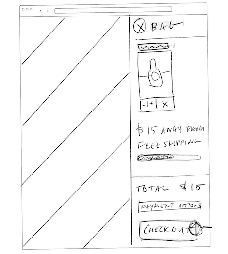
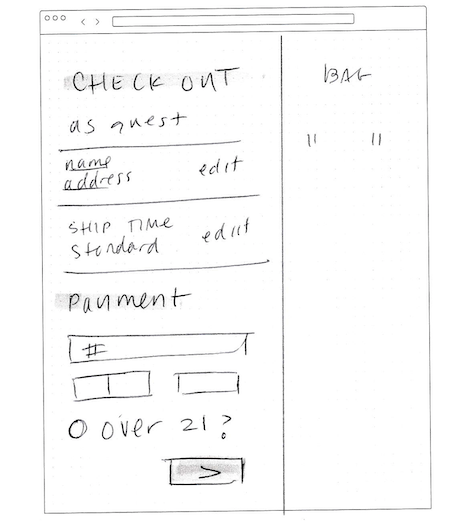
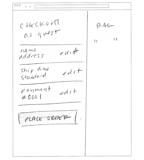
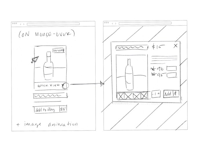
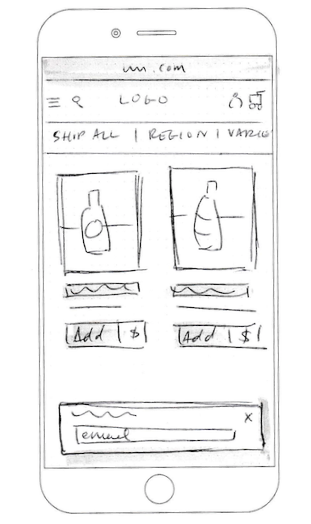
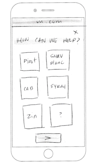
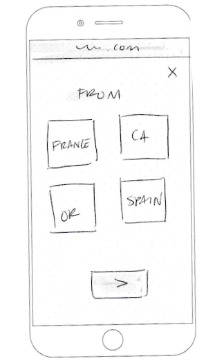
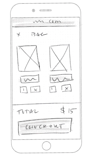
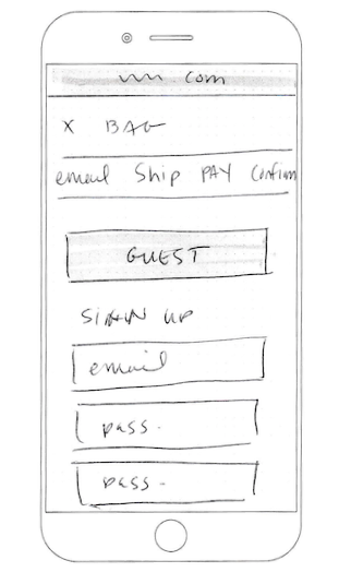
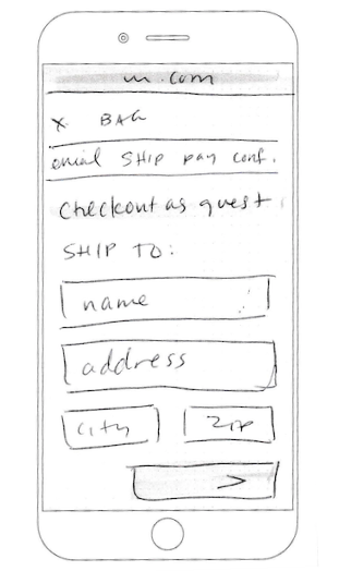
After digging into the data and research from interview participants, I spent my morning sketching ideas for the website. I began by sketching a common Red Route outlined in the User Flow above, and made sure to sketch a few quick examples of how the design could translate to mobile, as well.
Wireframes & Low Fidelity Testing
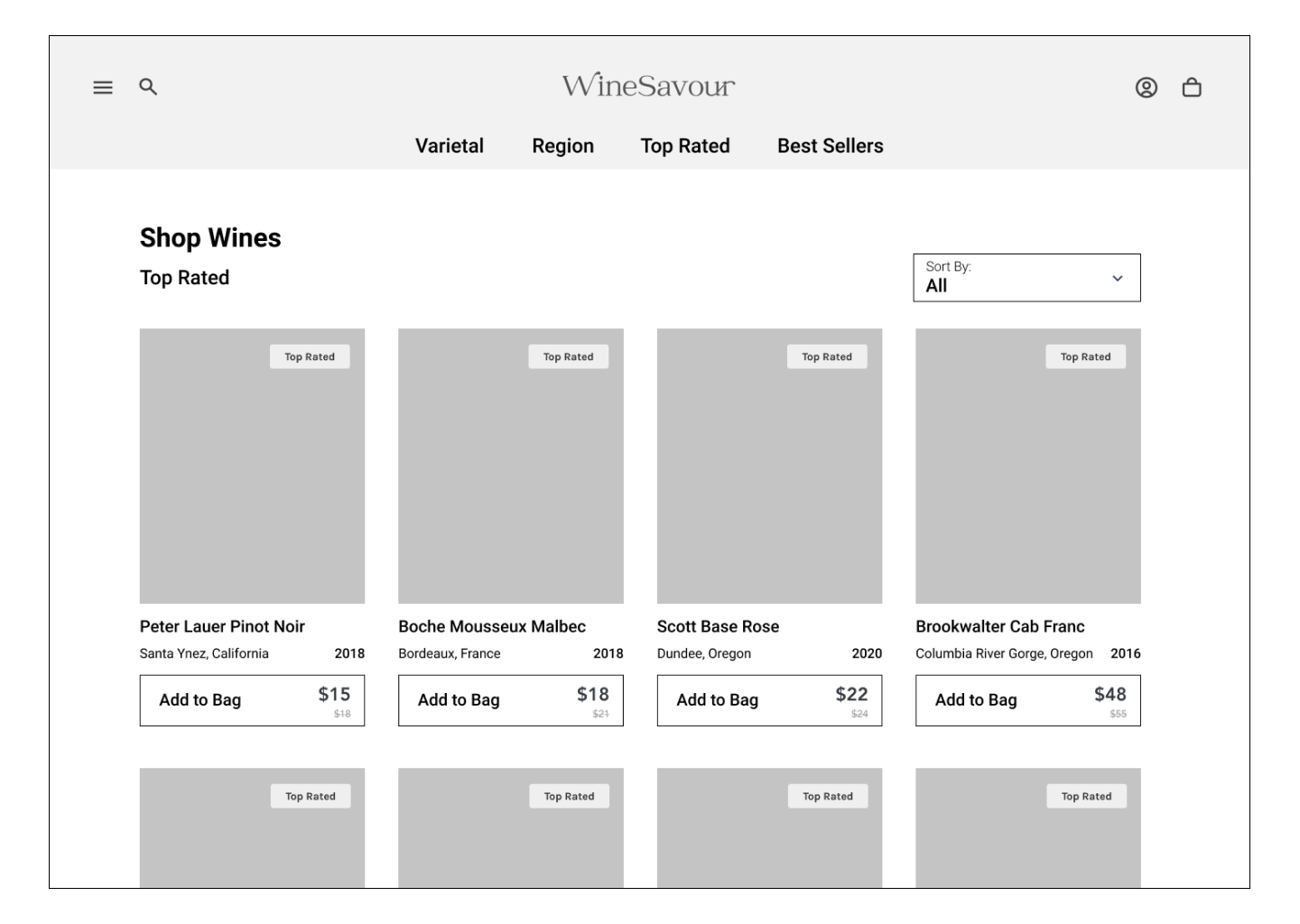
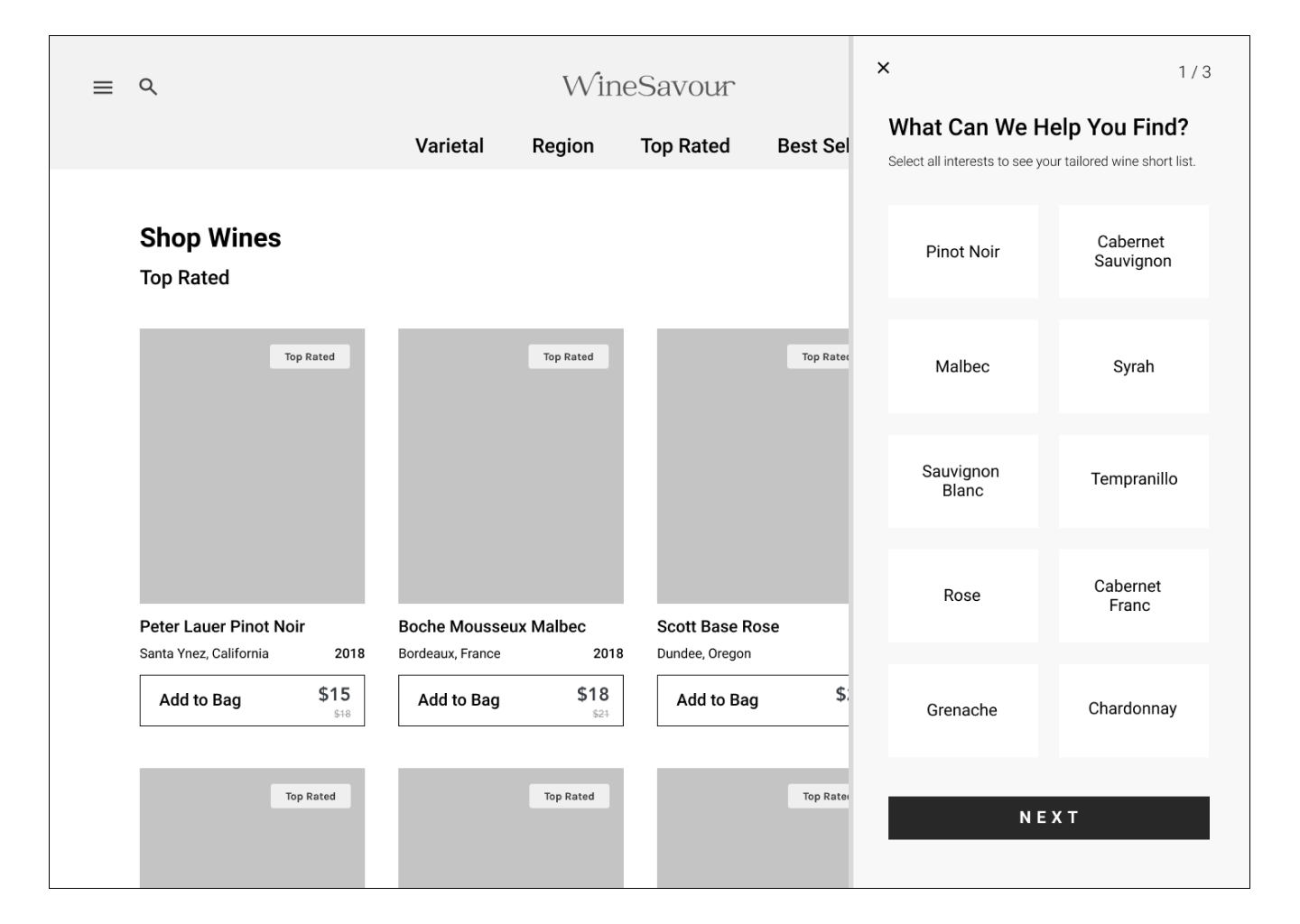
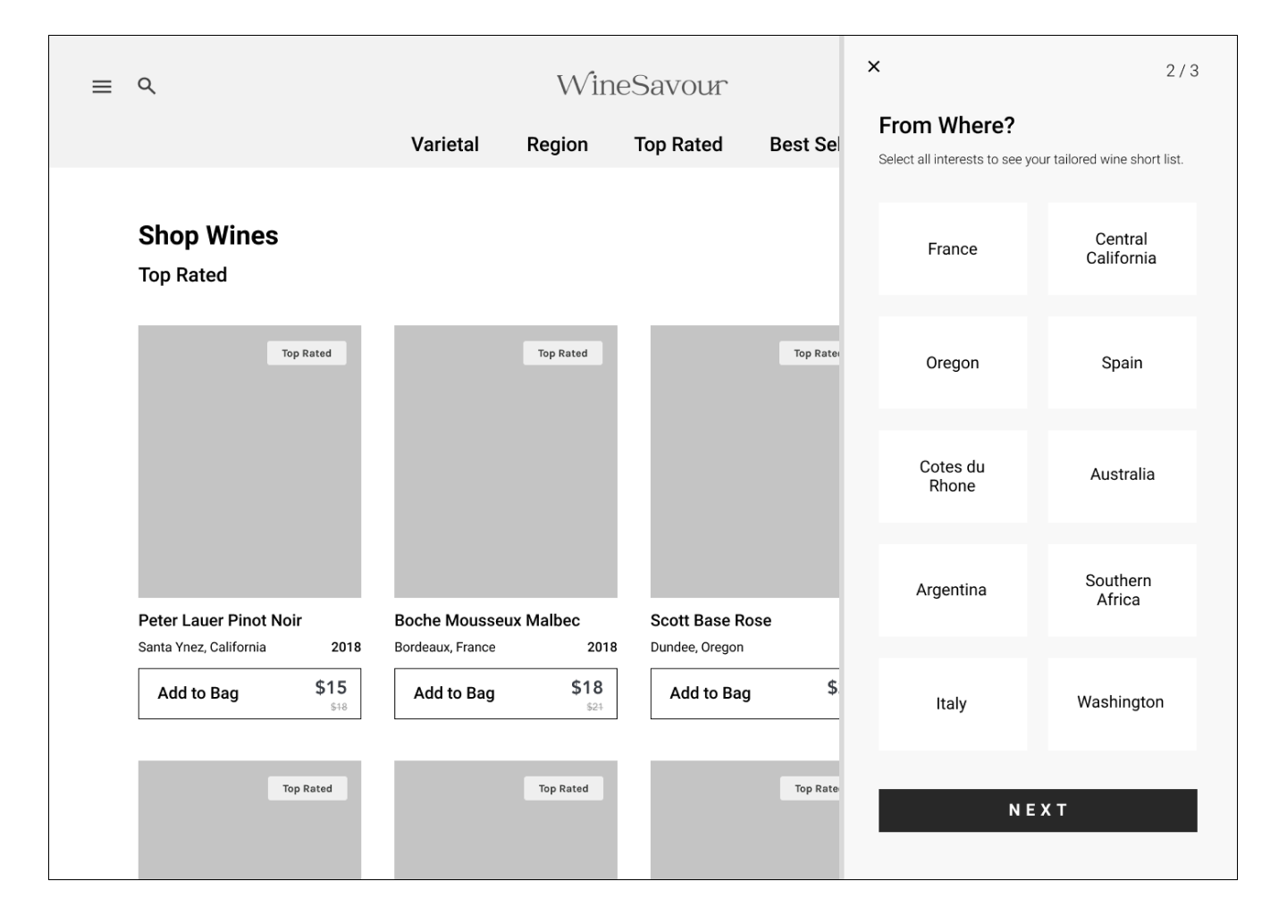
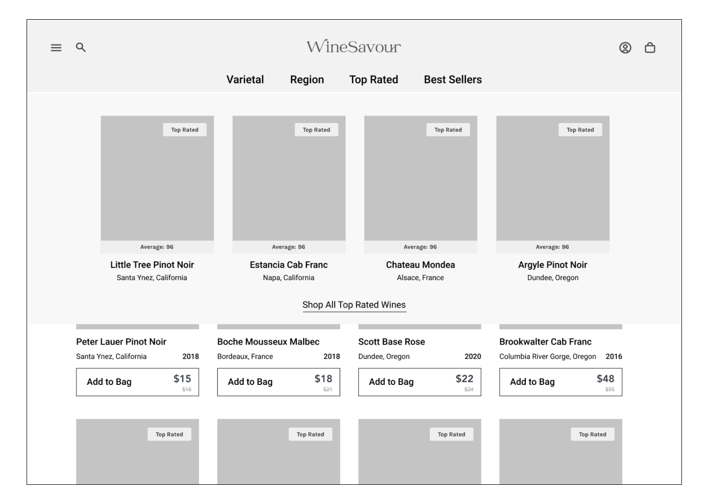
Once the sketches were complete and pinned on the wall, I used the afternoon to translate each sketch to a low fidelity mock up and used Figma’s prototyping feature in order to send the concepts into testing.
*Play the short video below to see the User Flow in action.
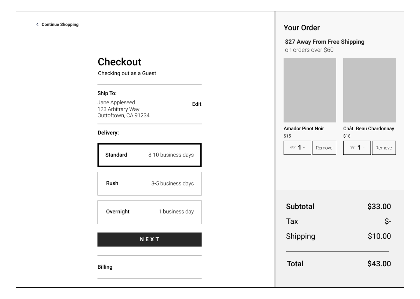
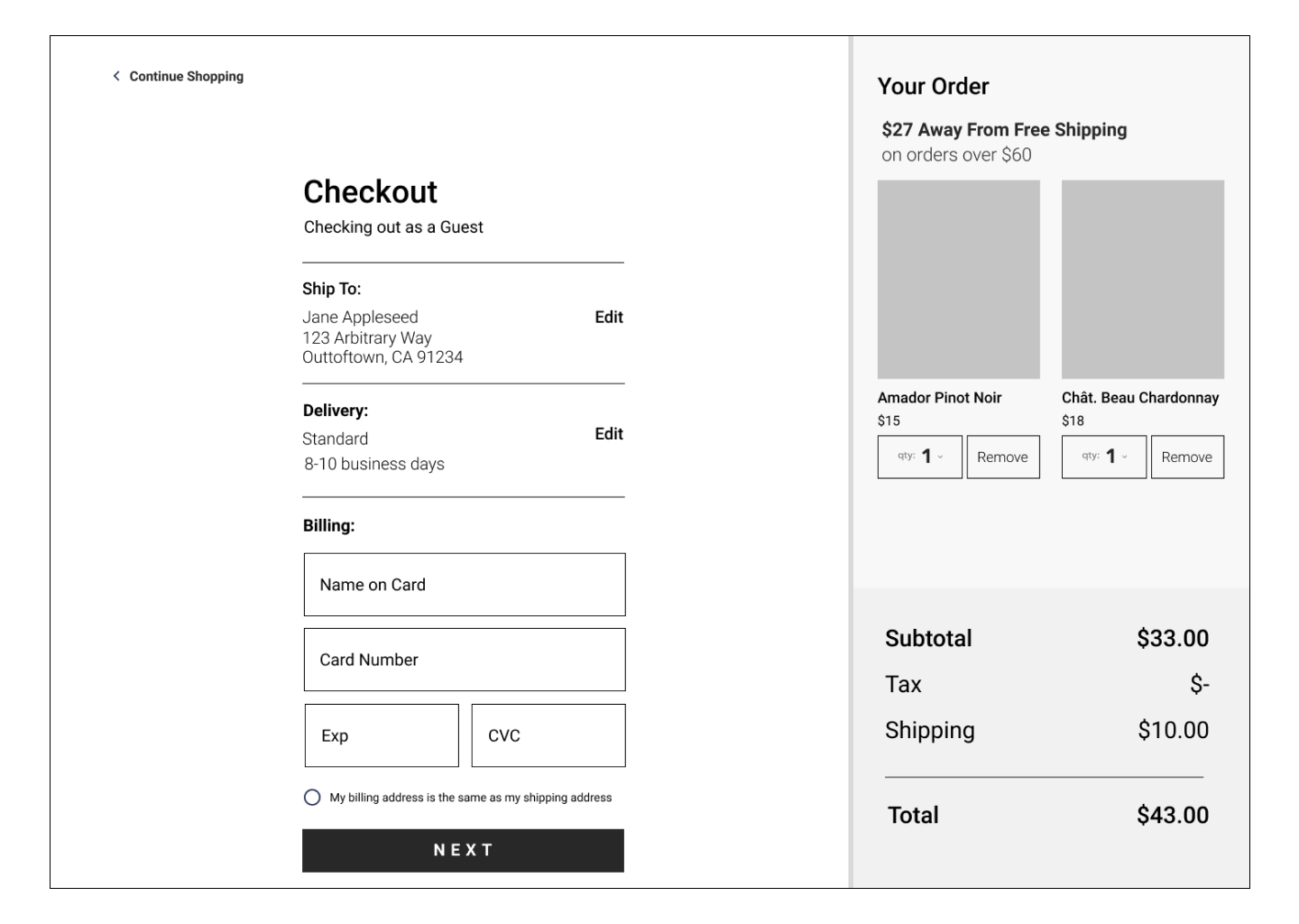
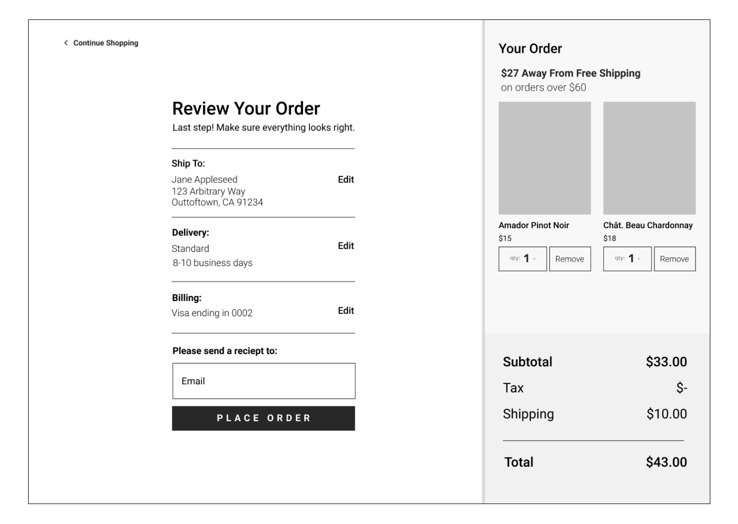
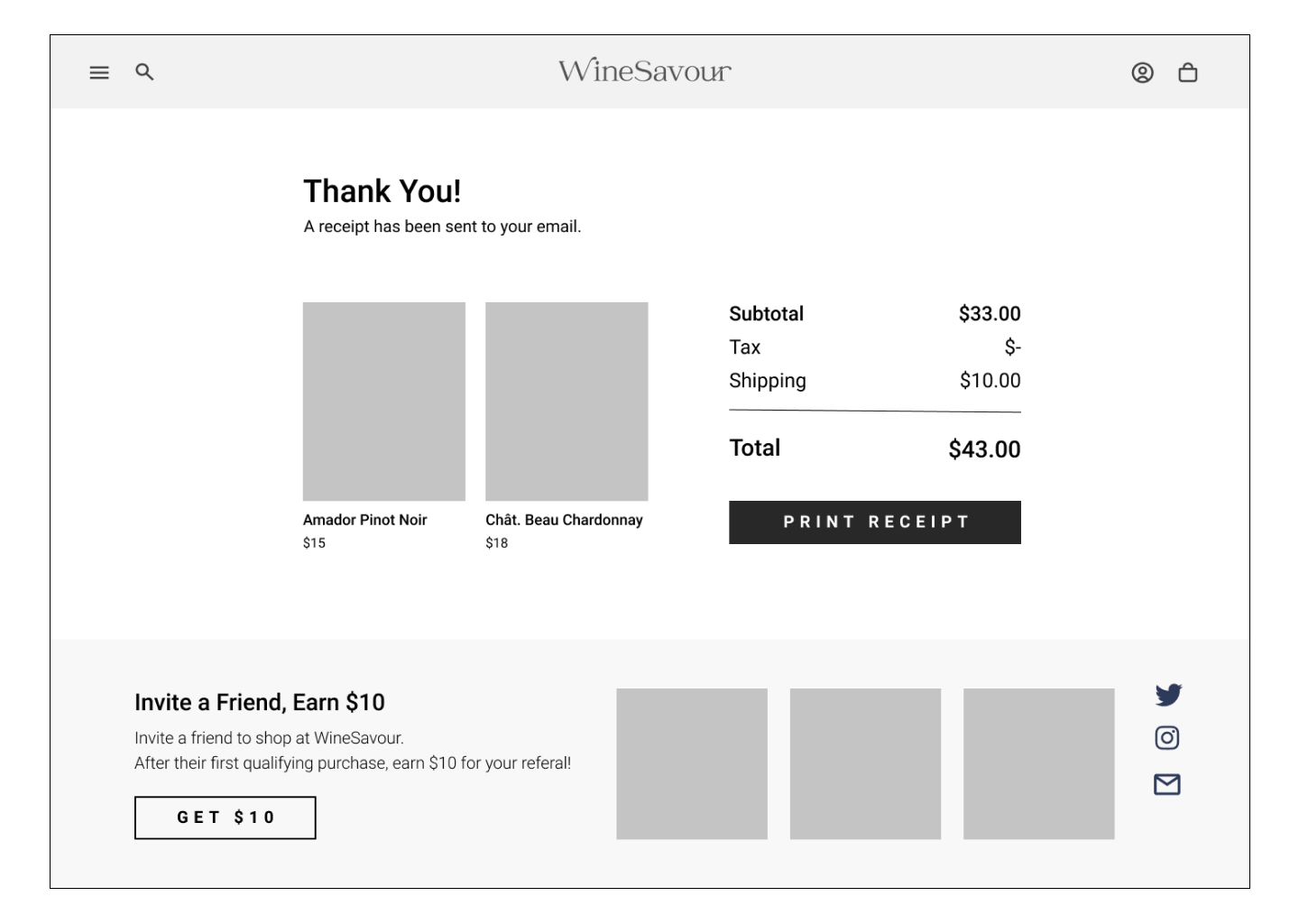
DESIGN PROCESS | VALIDATETesting Round One: Low Fidelity
After a series of guerilla testing from any and all guinnea pigs in my household, I hosted a series of Zoom testing sessions. Each session included a selection of tasks to test common red routes, navigation and the checkout process. I supplemented my testing with a series of unmoderated tests through Maze including user recall tests, task completion and card sorting.
Testing Summary | Insights
Wireframes to Hi-Fi: Solving for Testing Issues
Each testing issue was addressed as the wireframes were translated to hi-fi screens.
Testing Issue #1 | Button Usability
Criteria Buttons
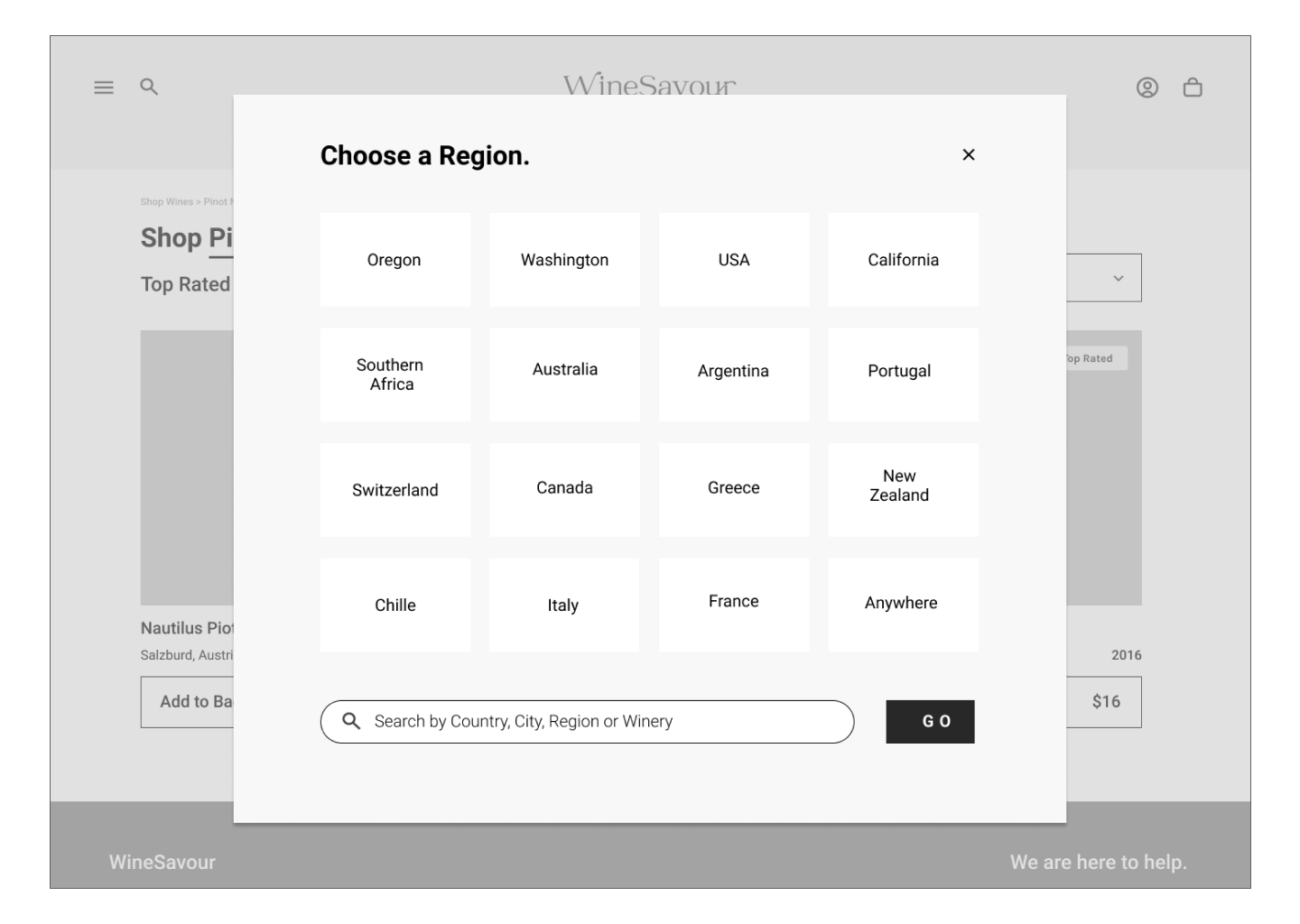
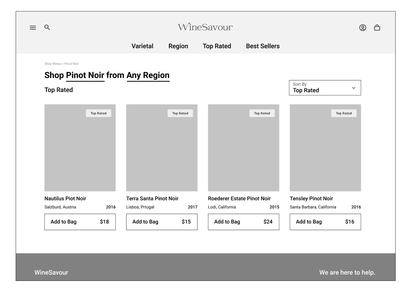
Critical Issue: Users report trouble finding a product by a series of two criteria (i.e. White Wine, then Oregon). After navigating to “White Wine” users are not selecting the “Choose Region” option to filter their search.
Hi-Fi Screen
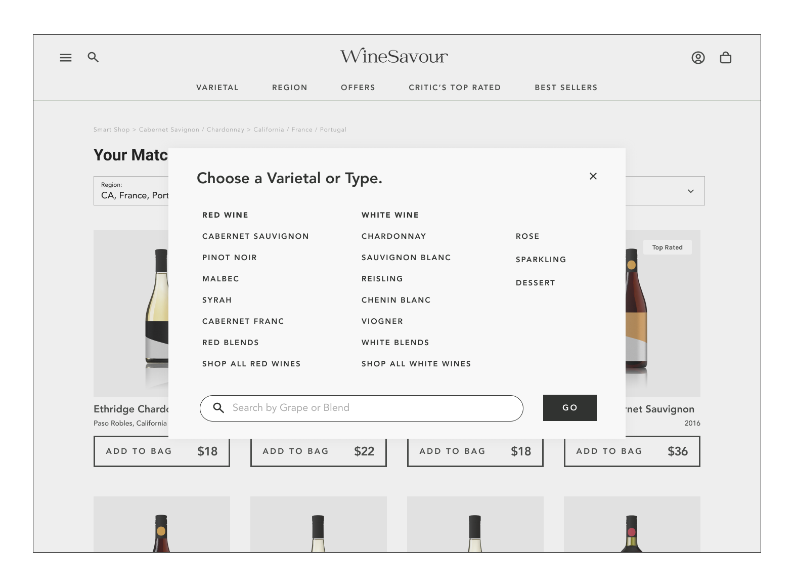
Solution: The underlined links were converted to expandable menus to promote interaction, and clarify that the user can input information to apply to their search.
Testing Issue #2 | Redundant Information
“Top Rated” Architecture
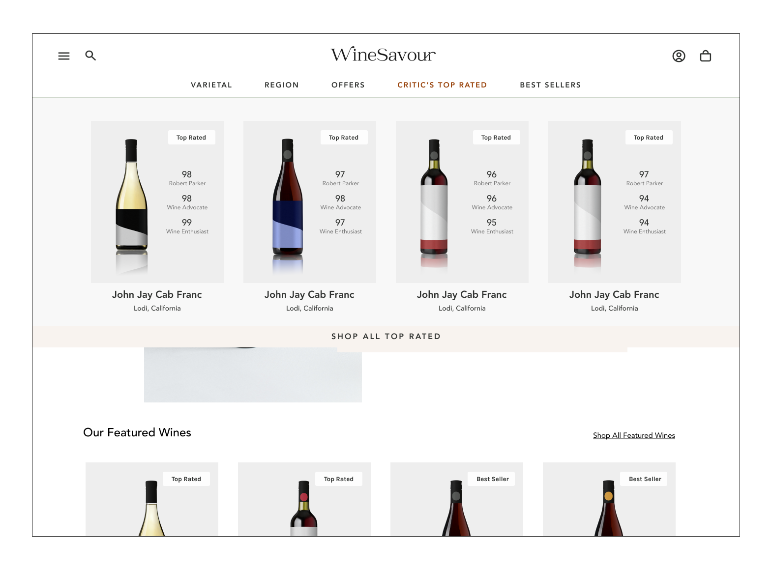
Major Issue: “Top Rated” appears to be confusing as a home page feature as well as a main navigation item. Users also are curious about who is rating the wines.
Hi-Fi Screen
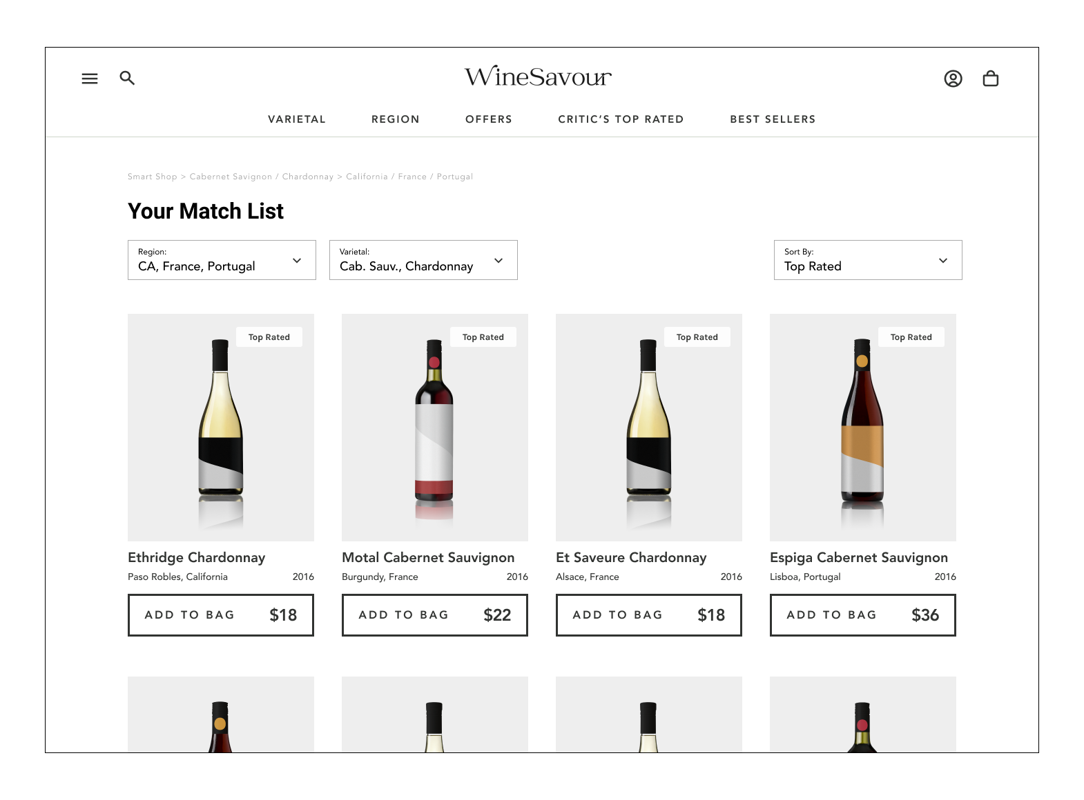
Solution: Change copy to “Critic’s Top Rated” to reduce confusion on who is rating, and add ratings to product images. Move Top Rated to the Sort By drop down, and set Top Rated to default sorting method.
Testing Issue #3 | Information Architecture
Navigation
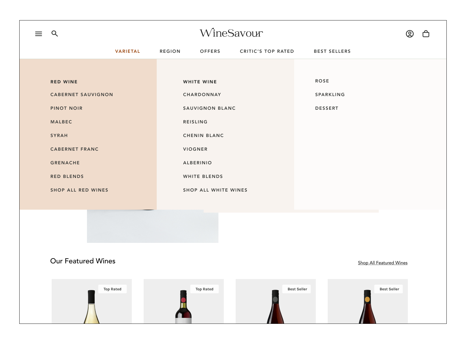
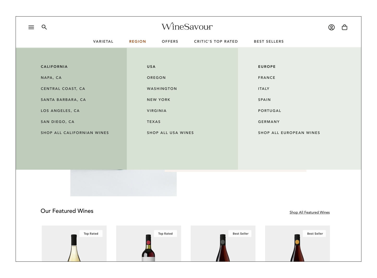
Major: Region and Varietal offer a good selection of options, however, they need to be organized to improve user experience when browsing.
Hi-Fi Screen
Solution: Create organized lists for sub-navigation content and color-block them into clear categories of region and terroir.
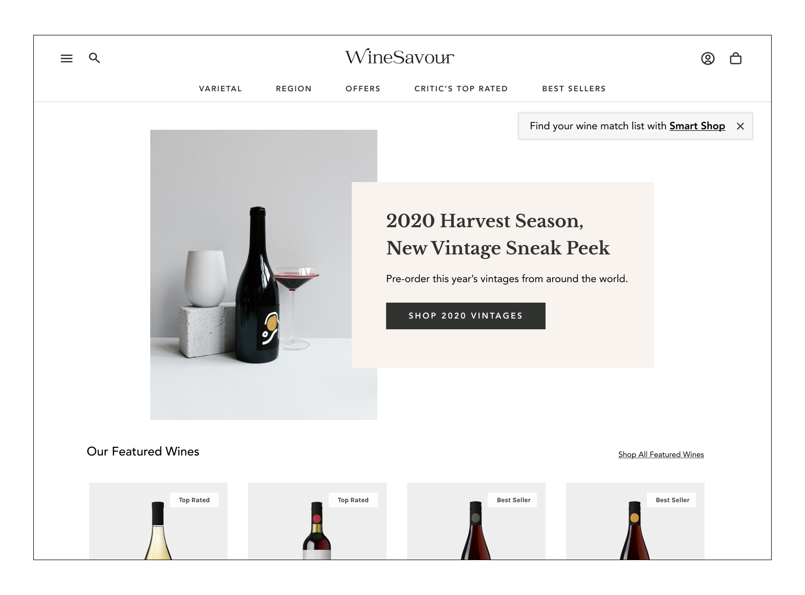
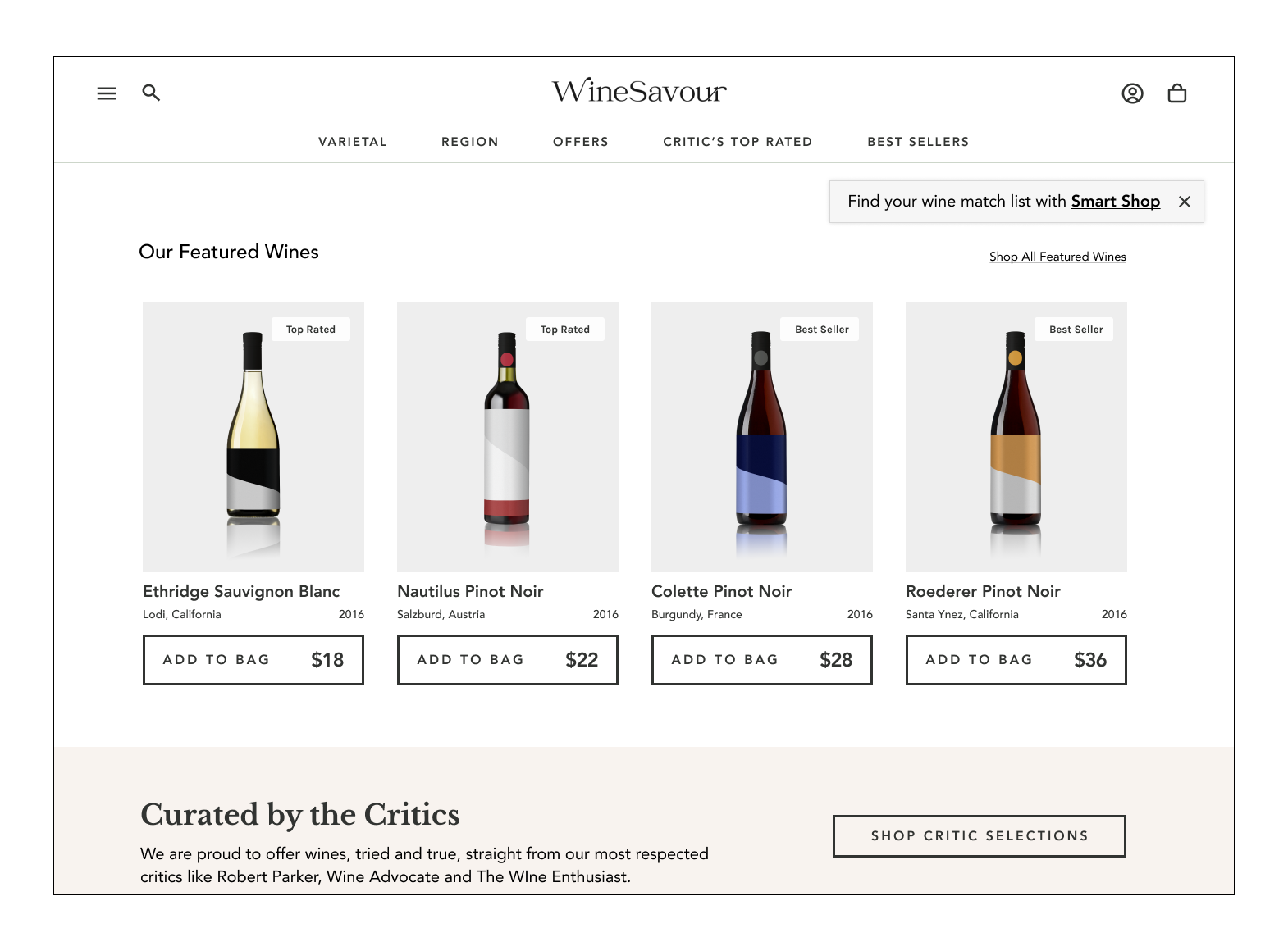
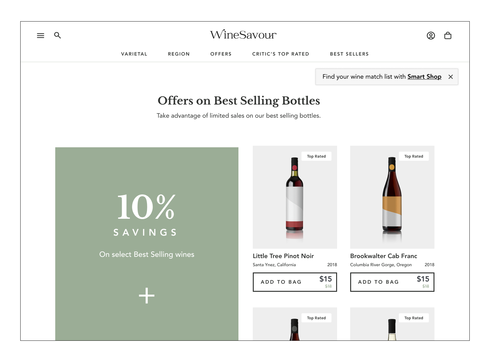
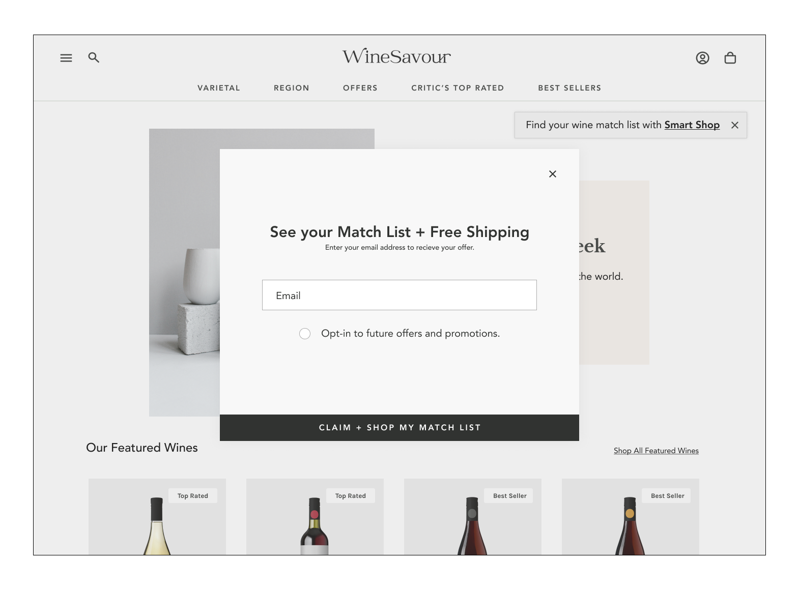
DESIGN PROCESS | ITERATEHigh Fidelity Screens: Version One
*Press play below to see version one in action
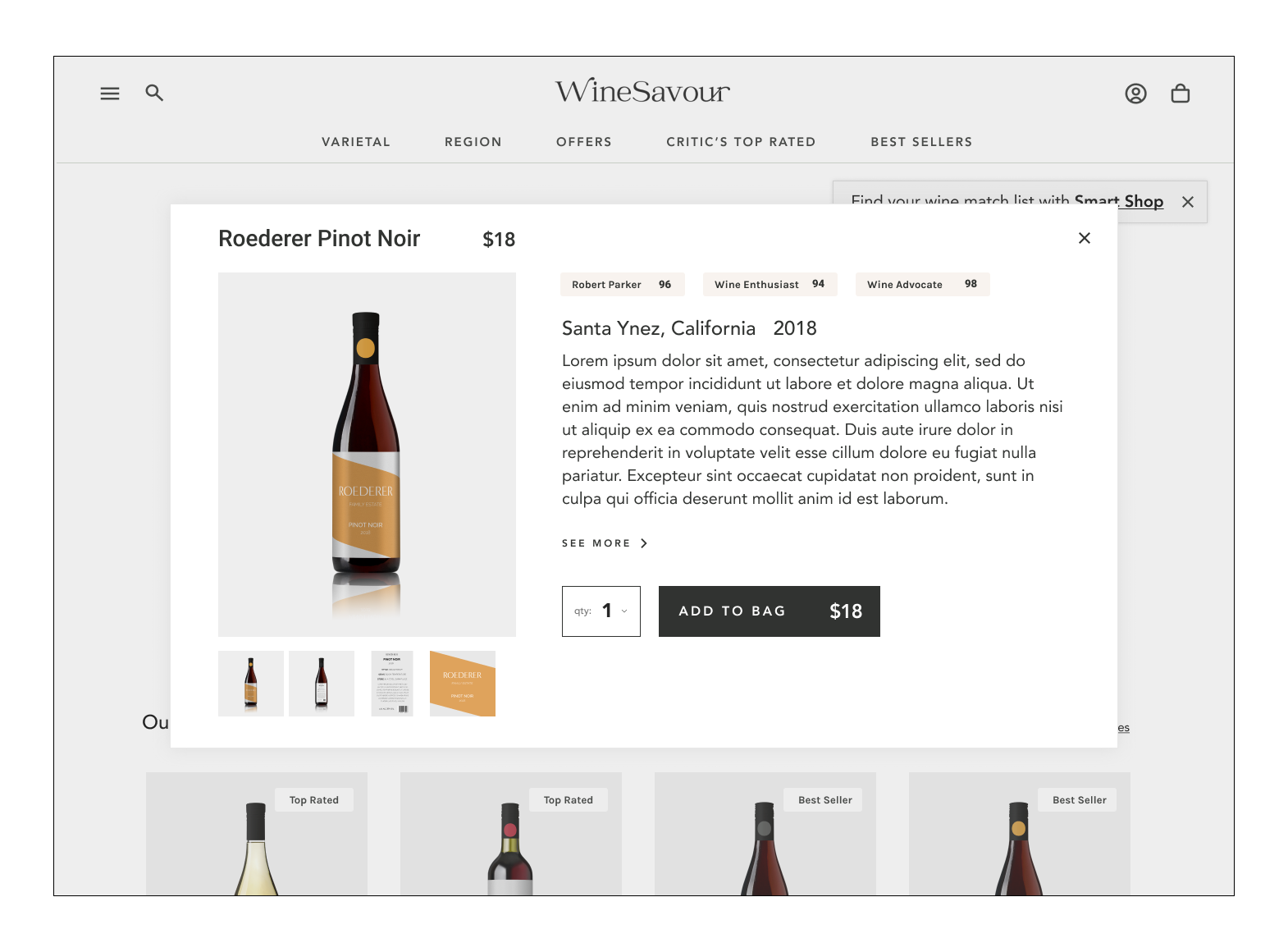
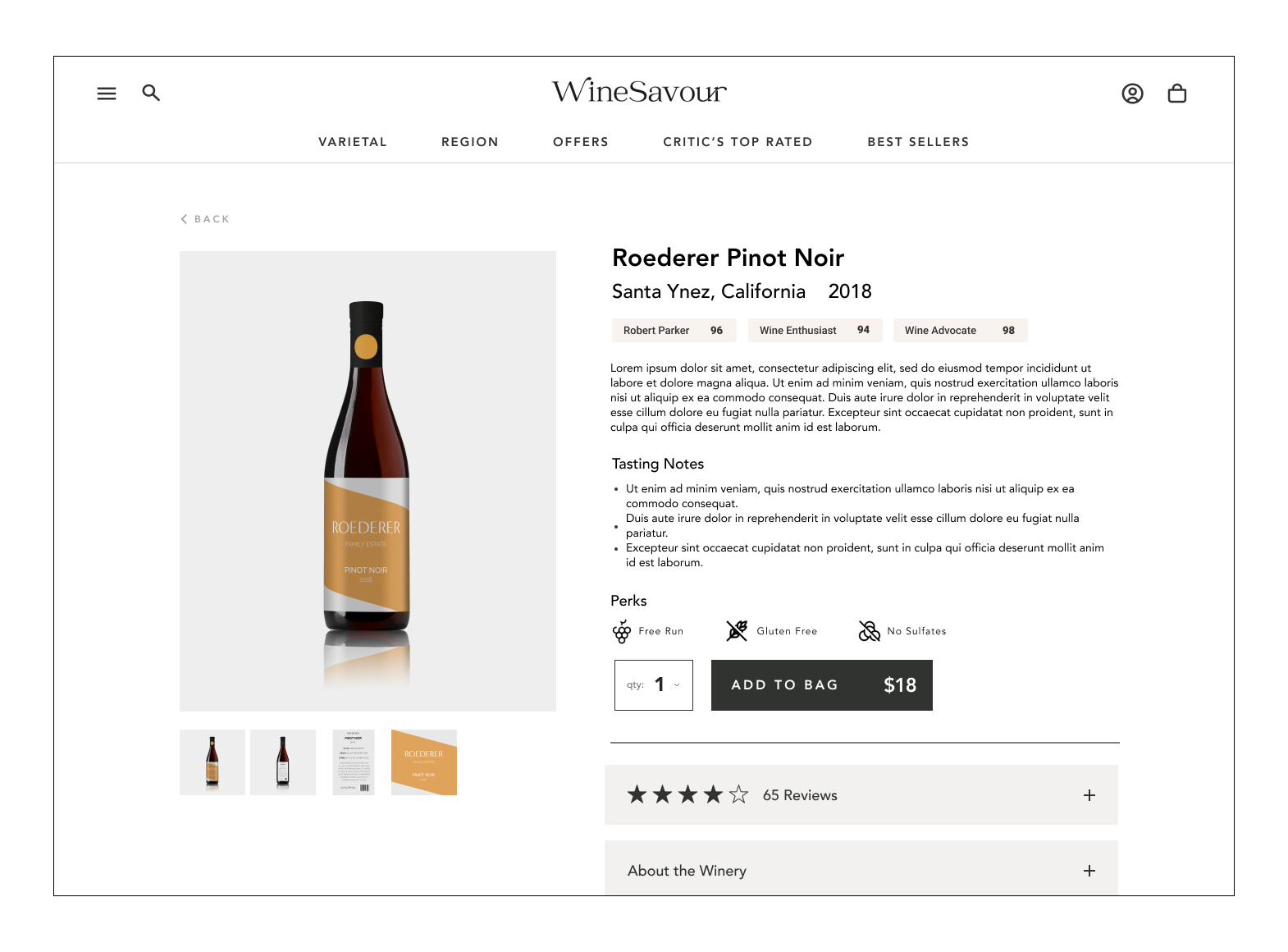
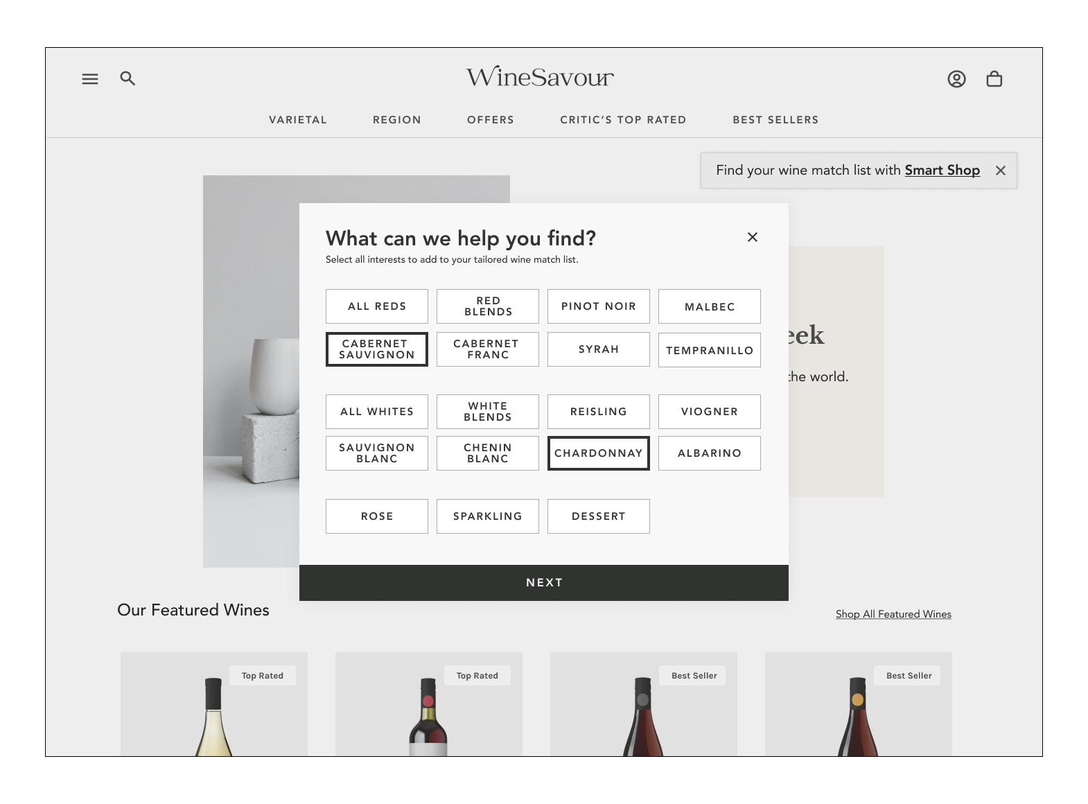
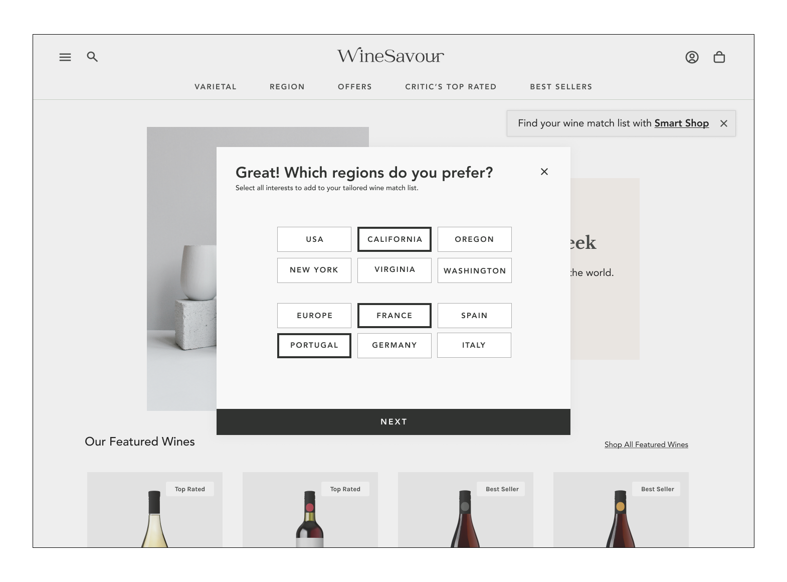
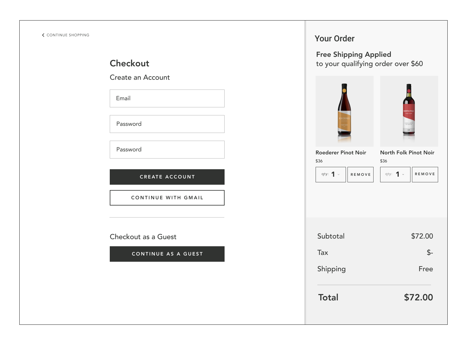
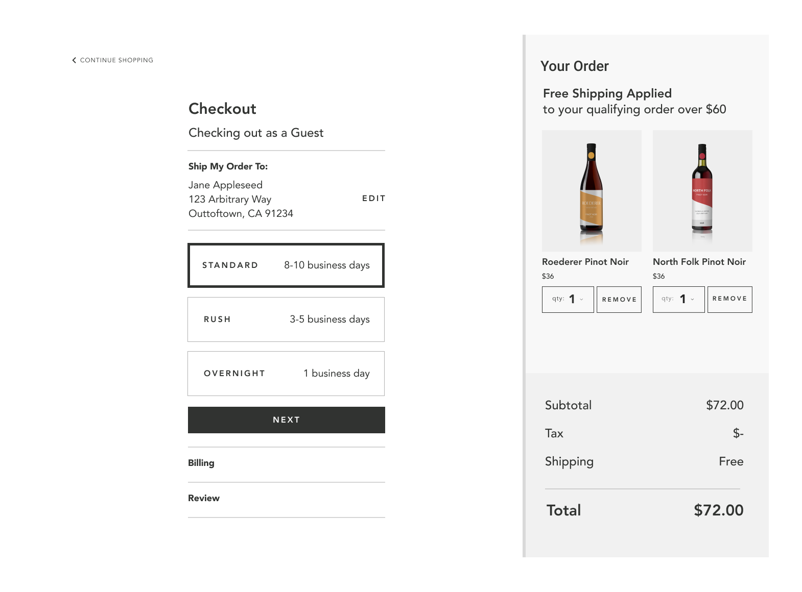
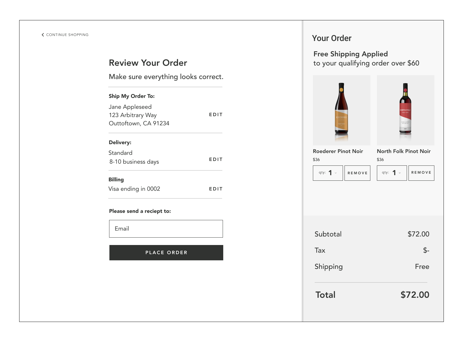
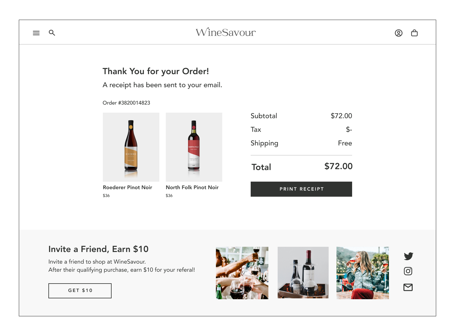
Translating to Mobile
Keeping responsive design in-mind, 4 key mobile screens were designed in high fidelity.
DESIGN PROCESS | VALIDATETesting Round Two & A Final Prototype
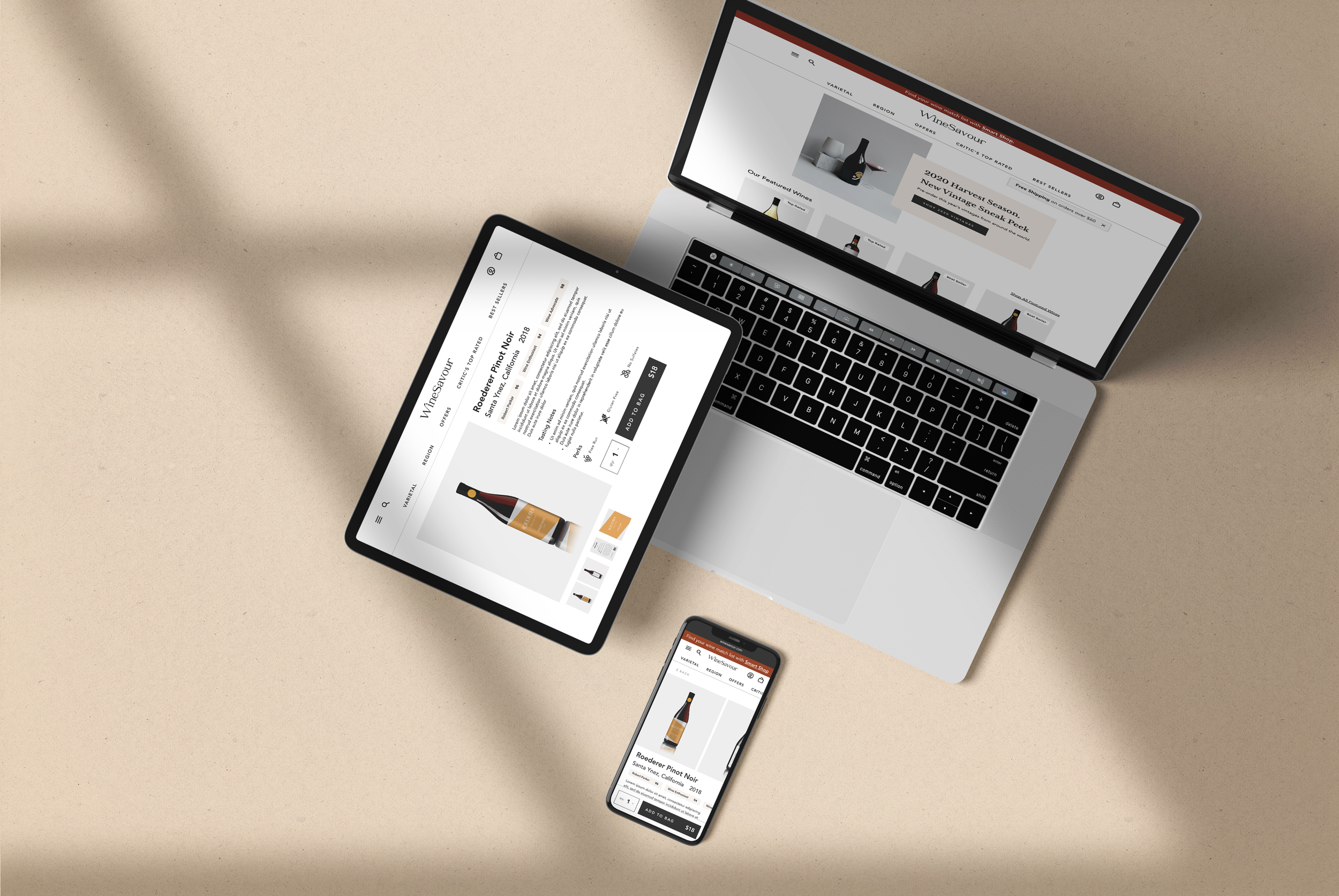
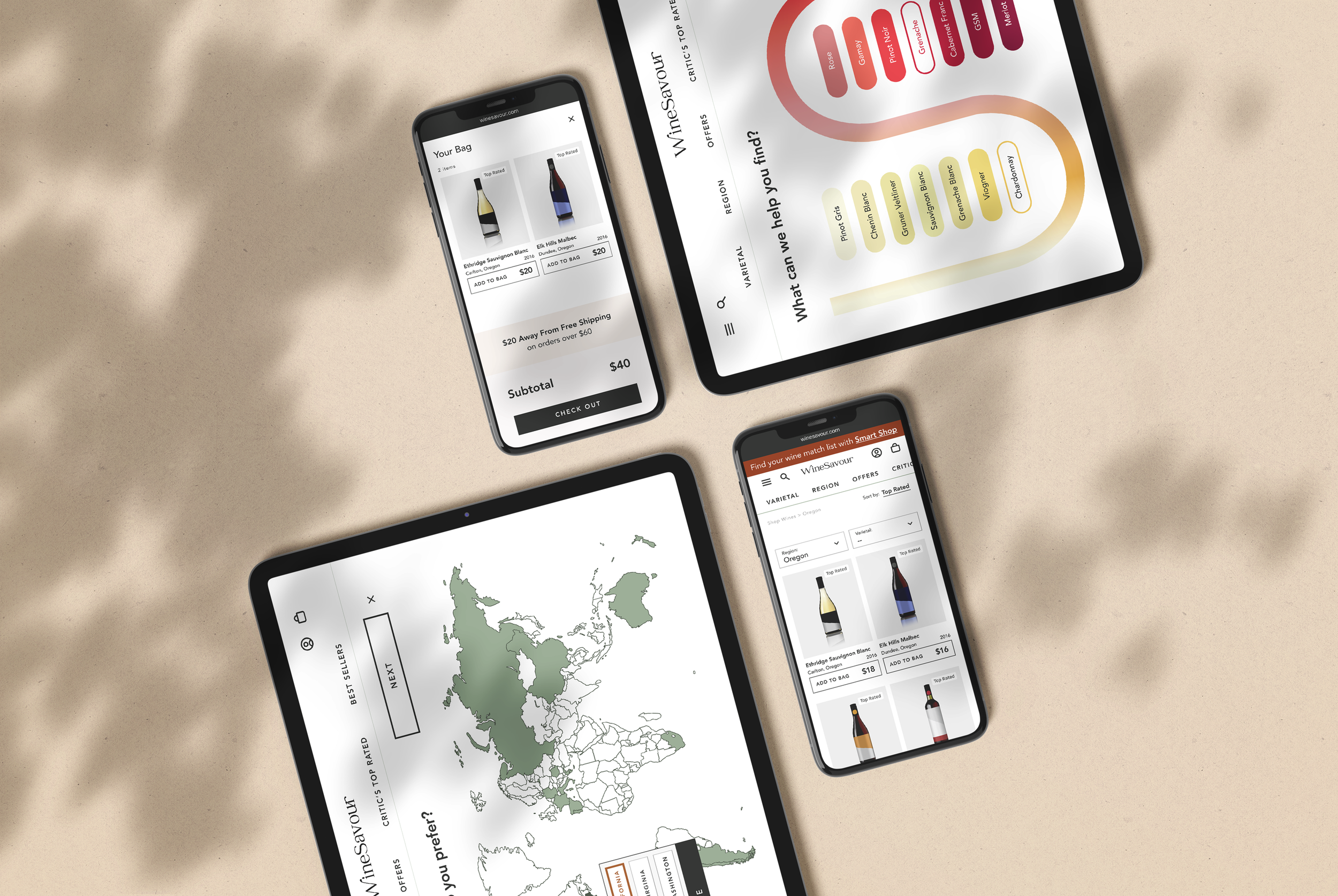
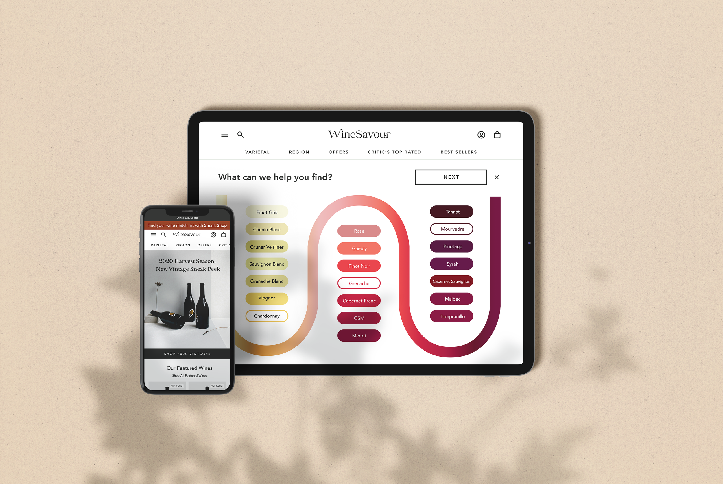
Moderated and unmoderated sessions tested the success of the high fidelity prototype. After identifying a handful of minor changes, and re-designing the Smart Shop feature to create a more interactive experience, the final prototype is presented!
What’s Next?
After a rapid-paced journey from research to testing, WineSavour developed into a successful product for its user base. The Smart Shop feature allows the user to “fill their basket” with a variety of their favorite selections, in new combinations—that is a wine collector’s dream—to fill up on sure-fire wine selections from their favorite regions, vines and wineries.
After 4 weeks of work and a moment of retrospection, I outlined 2 goals for future iterations.
Hover Animations
Product imagery is a major incentive for users. Visualizing products in motion would increase the interactive nature of the site.
As a new feature, hovering on product images in list view would toggle or animate to spin the bottle to the back label, just like one would do in a store.
Tasting Journal
After the first purchase, the website would be improved by prompting the customer for feedback on their wines to collect a user rating summary.
This summary, or “tasting journal” could be used to organize purchases and promote repurchase rates.
More Projects
Ralli | Mobile Voter Guide
An end-to-end study and solution to help young voters vote.
Post Up Design Sprint
A 5-day sprint to help remote workers find a public space to work.


