Design Challenge
Design Solution for Roommates & Renters
Finding and keeping a roommate is getting increasingly challenging as the average marriage age increases, growing the pool of current renters. How might we offer a solution for people looking for a new roommate, and prospective roommates looking for a new space to rent?
Design Requirements
Design for Mobile
Appeal to Millennials (24-40)
Make it safe
New York City-based
DESIGN PROCESS | DEFINE Understand & Map
After defining the project plan and tasks over the course of 5 days, I started by talking with 3 people within the age demographic who have extensive roommate experience. One of the participants recently lived in New York while attending NYU.
Then, I looked into a variety of articles and home/lifestyle blogs that covered topics on finding roommates, traits to look for or avoid, and tips on how renters and landlords can protect themselves legally. I also researched products that attempt to solve a similar issue and made notes about their successes and failures.
I gathered data and made an affinity map to organize the conversations and notes, then identified trends.
Affinity Map: zoom in & read in Figma
Selecting the Core Components of design zoom in & read in Figma
Creating Personas
After mapping out trends and learning more about users, I translated some of that data into personas to keep in mind as I form solutions.
Persona #1, zoom in and read if Figma
Persona #2, zoom in and read if Figma
Exploring User Journeys
I dove into a flow of touchpoints, tasks, and experiences for each persona; thinking methodically through a thread of goals for each user. In this case, there are two separate users with different use cases.
User Journey Map #1, Lister Looking for a Roommate: zoom in and read in Figma
User Journey Map #2, Renter Looking for a Rental + Roommate: zoom in and read in Figma
Organizing User Flow
Before putting pen to paper, I mapped out a flow of screens to guide which pages to design first, and which are periphery. Then, distinguished which screens will vary depending on the use case.
User Flow, Renter Looking for a Rental: zoom in and read in Figma
User Flow, Lister Looking for Roommate: zoom in and read in Figma
DESIGN PROCESS | IDEATESketching & Wireframing
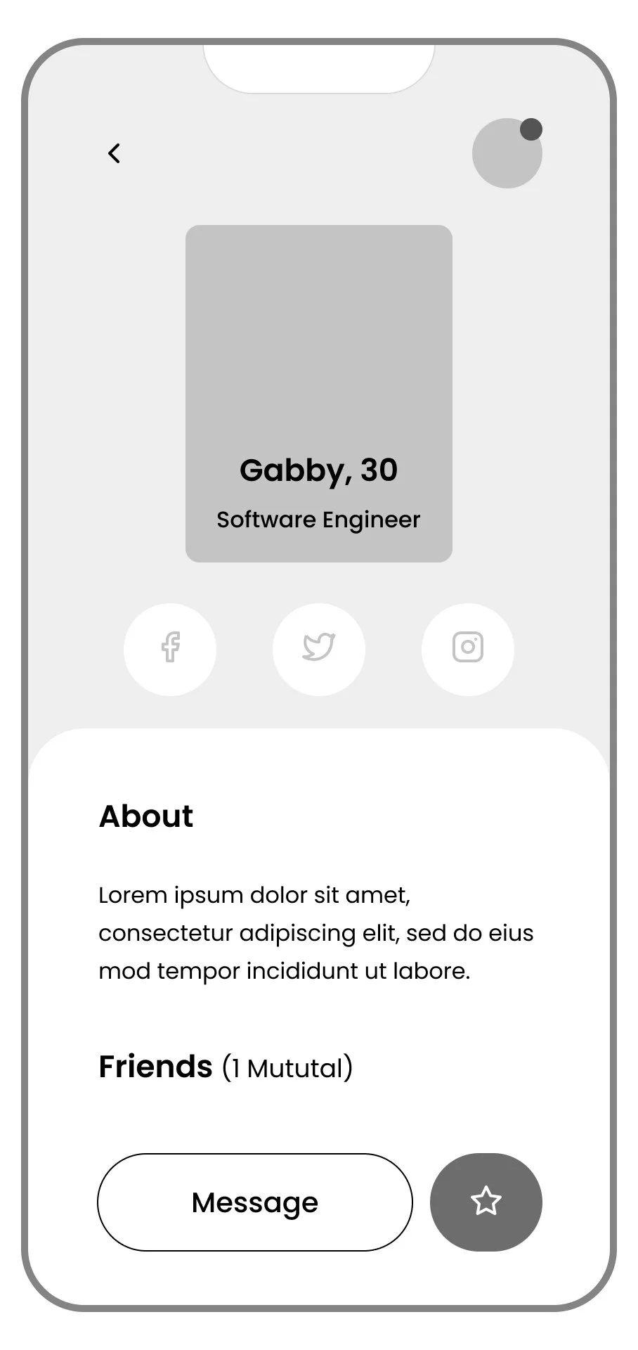
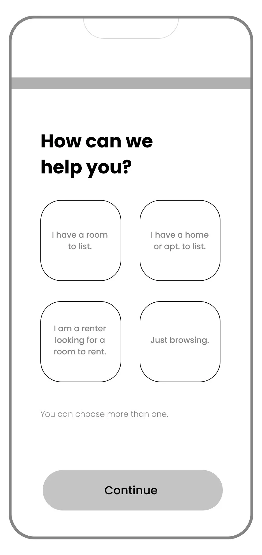
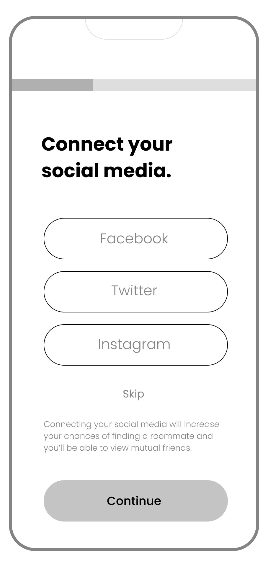
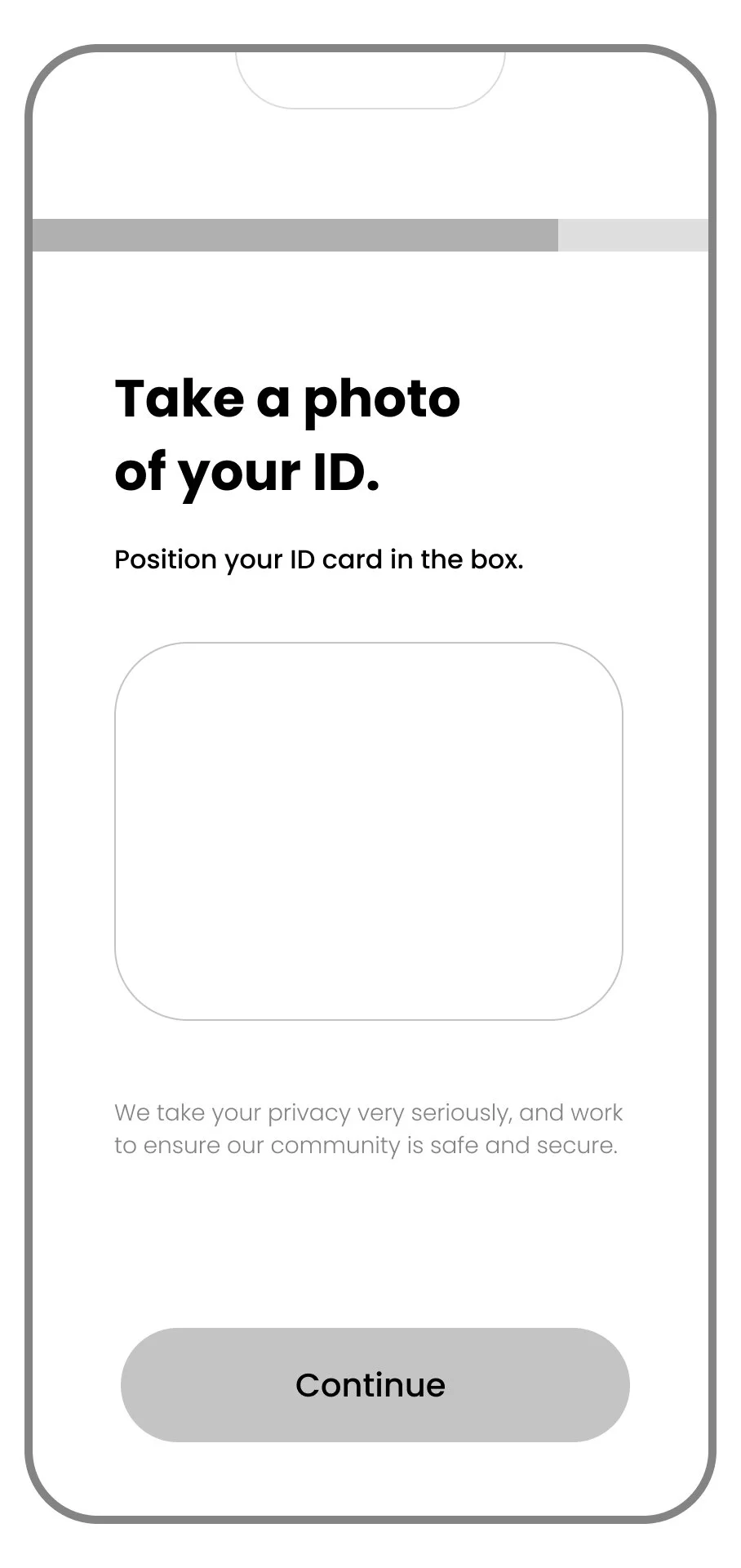
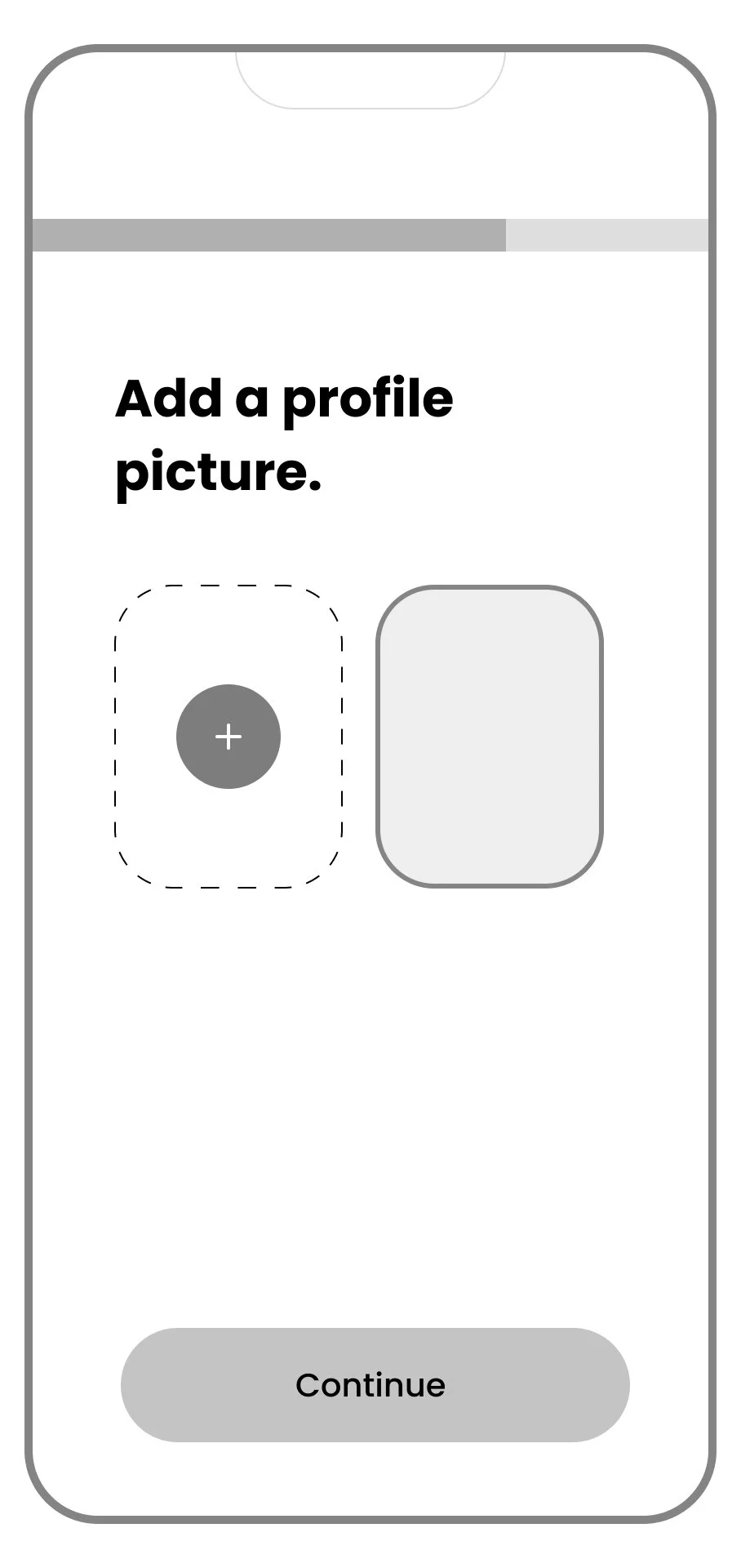
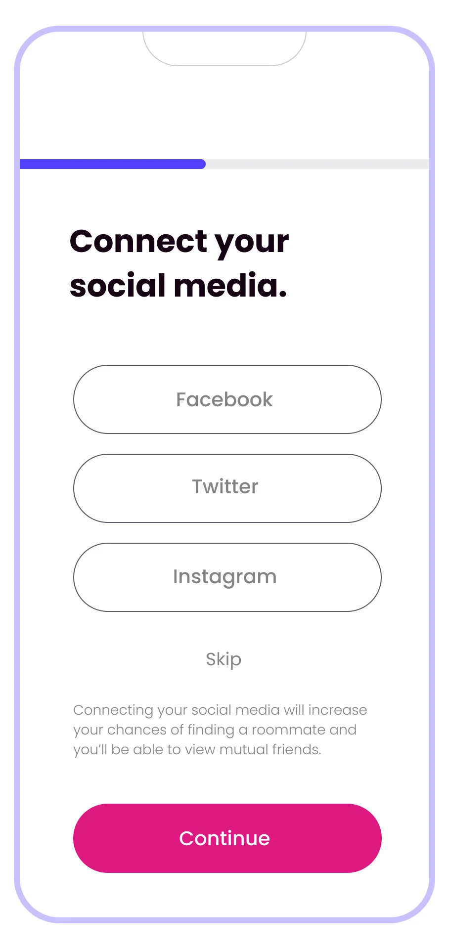
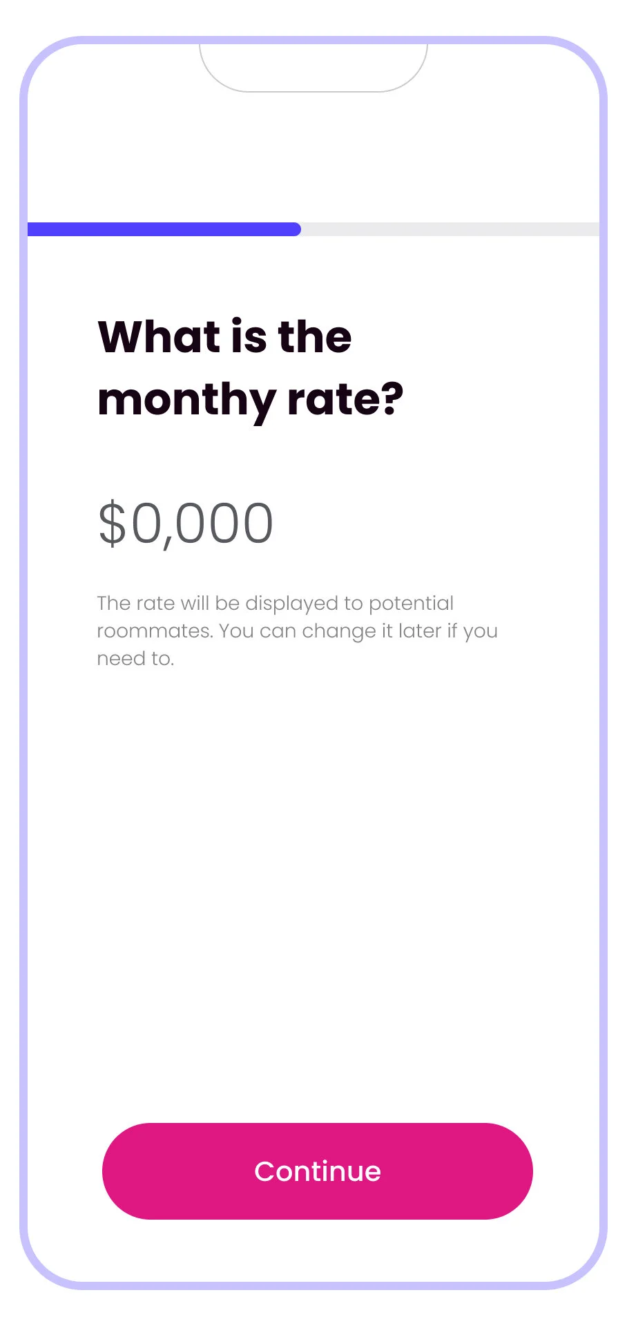
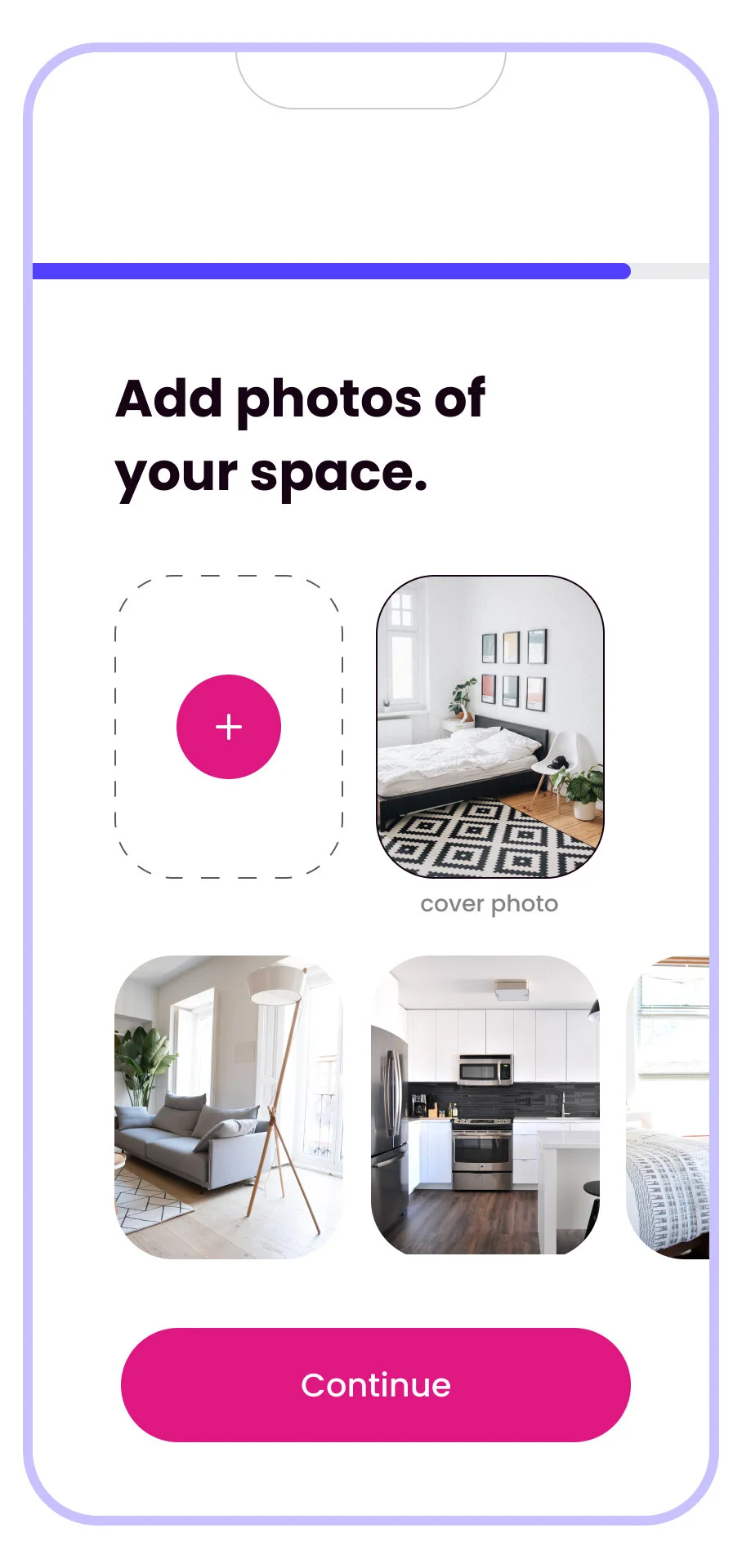
Using maps as a logistical and conceptual guide, I started to sketch ideas. To warm up, I chose a key screen for both use cases: the Roommate Profile screen, and quickly sketched 6 examples of that screen. Then, I narrowed down the best solution and sketched the screens on either side of its user flow to land at the following 8 screens in the flow.
Wireframes
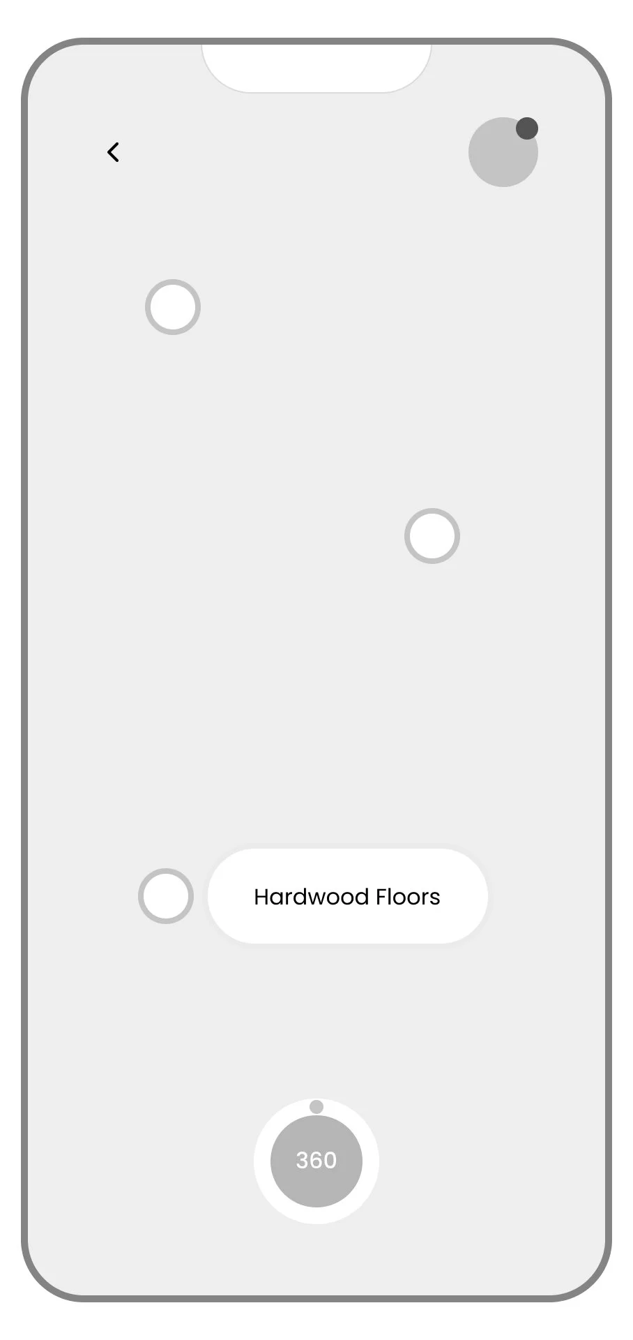
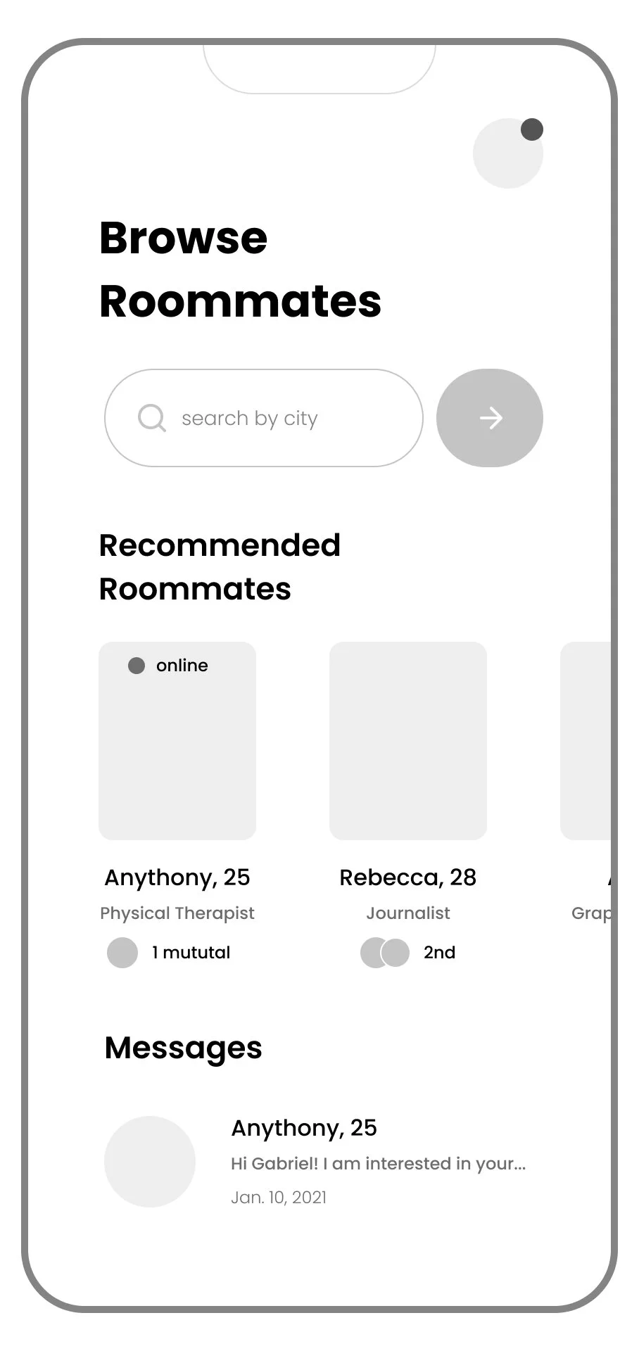
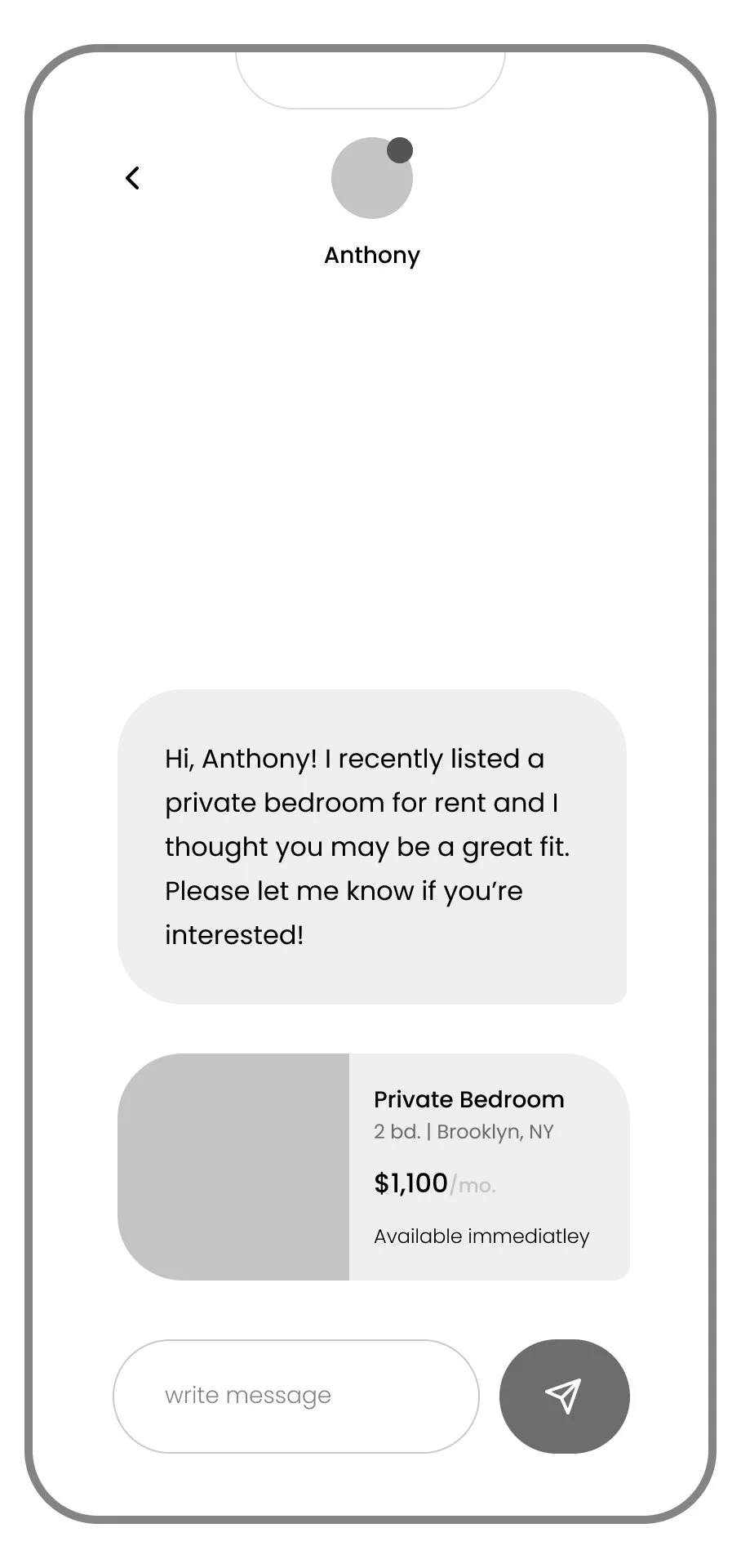
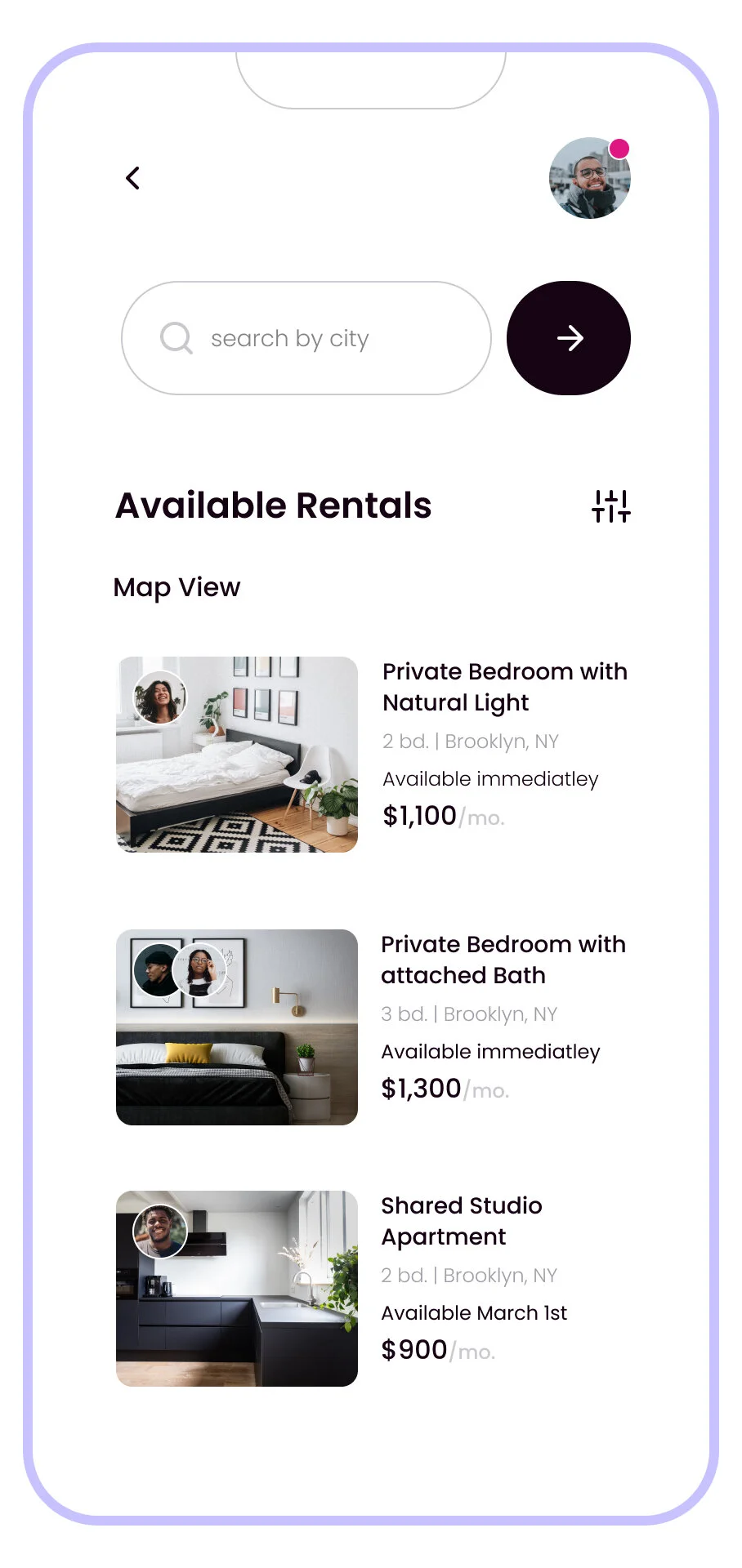
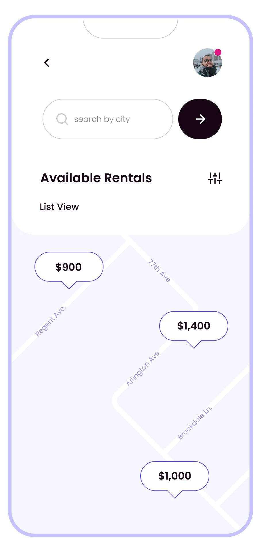
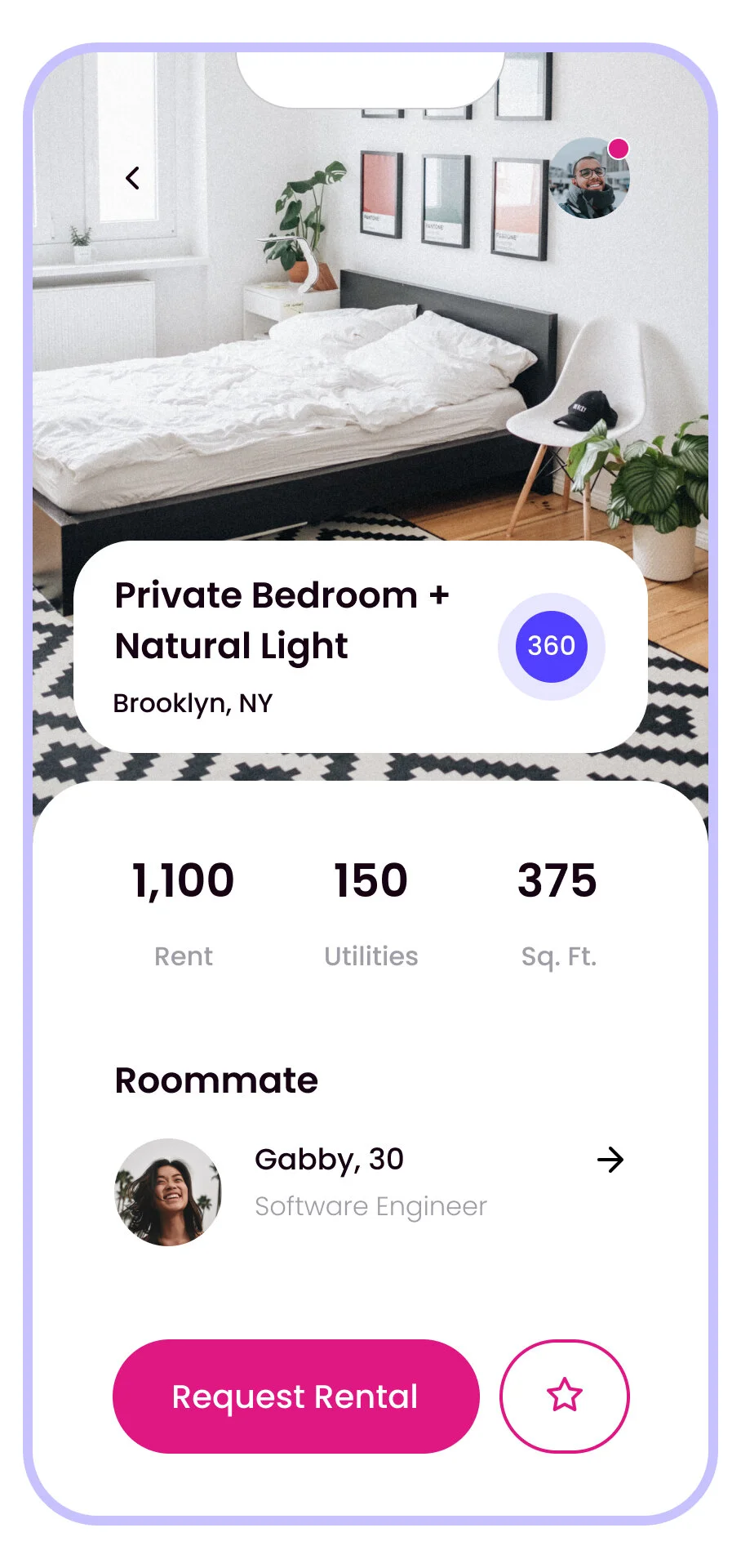
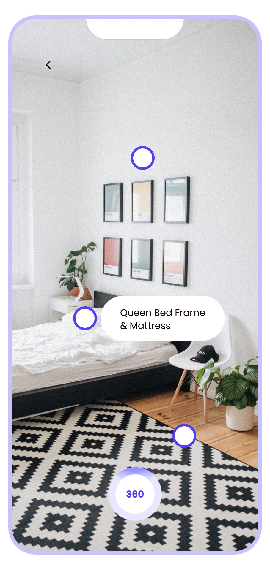
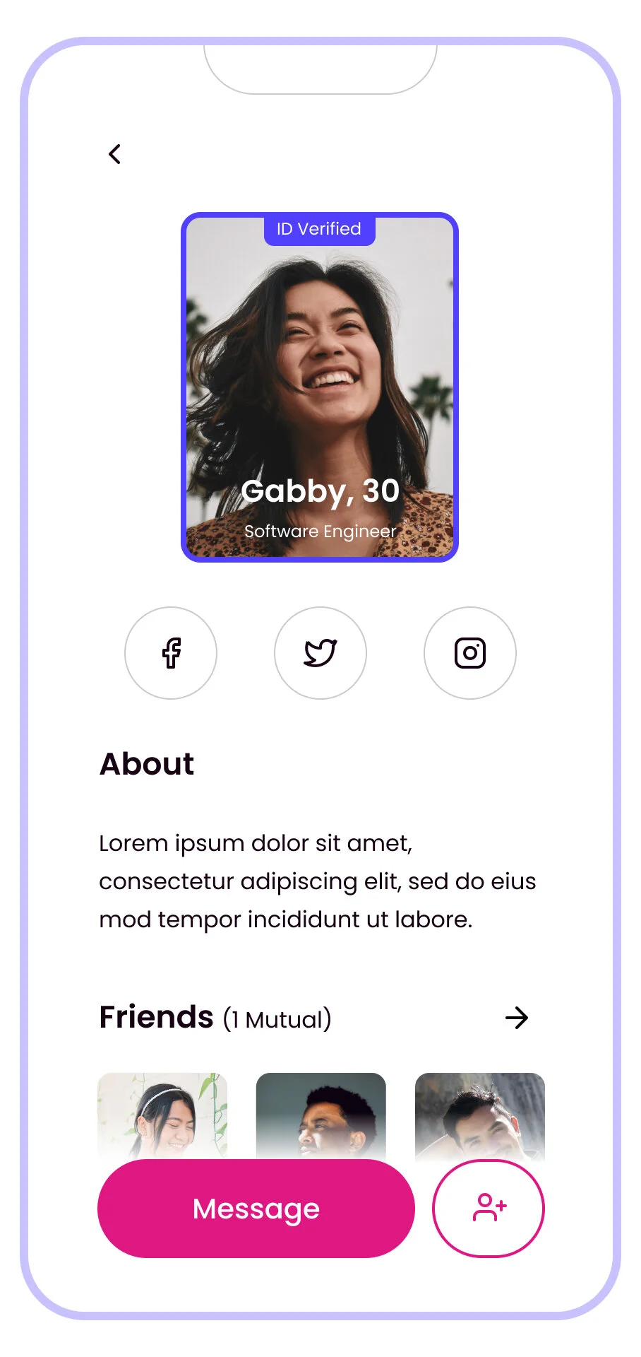
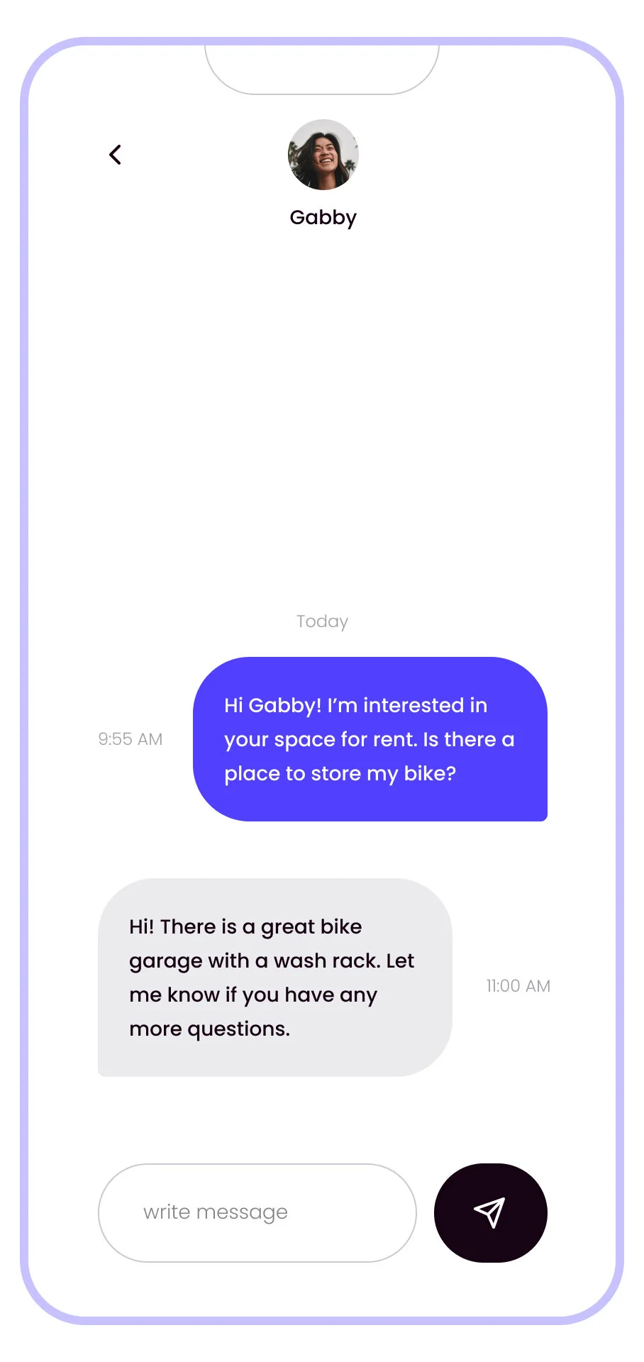
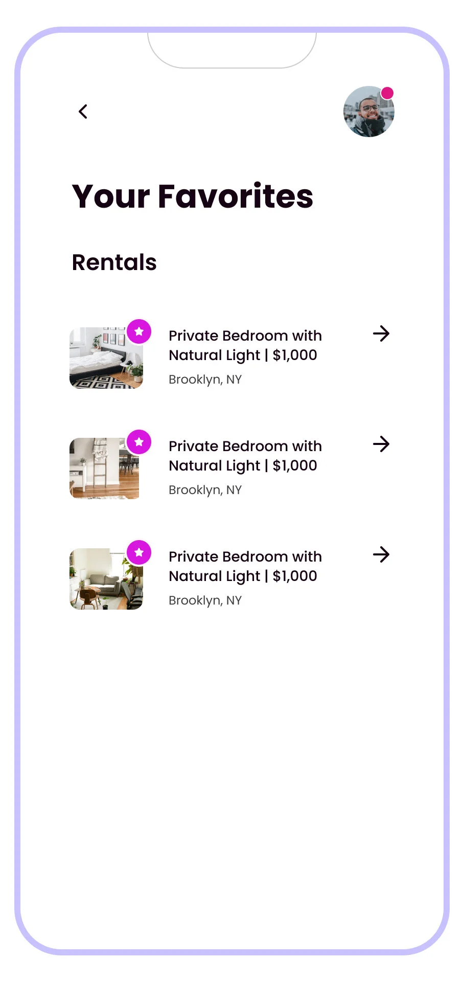
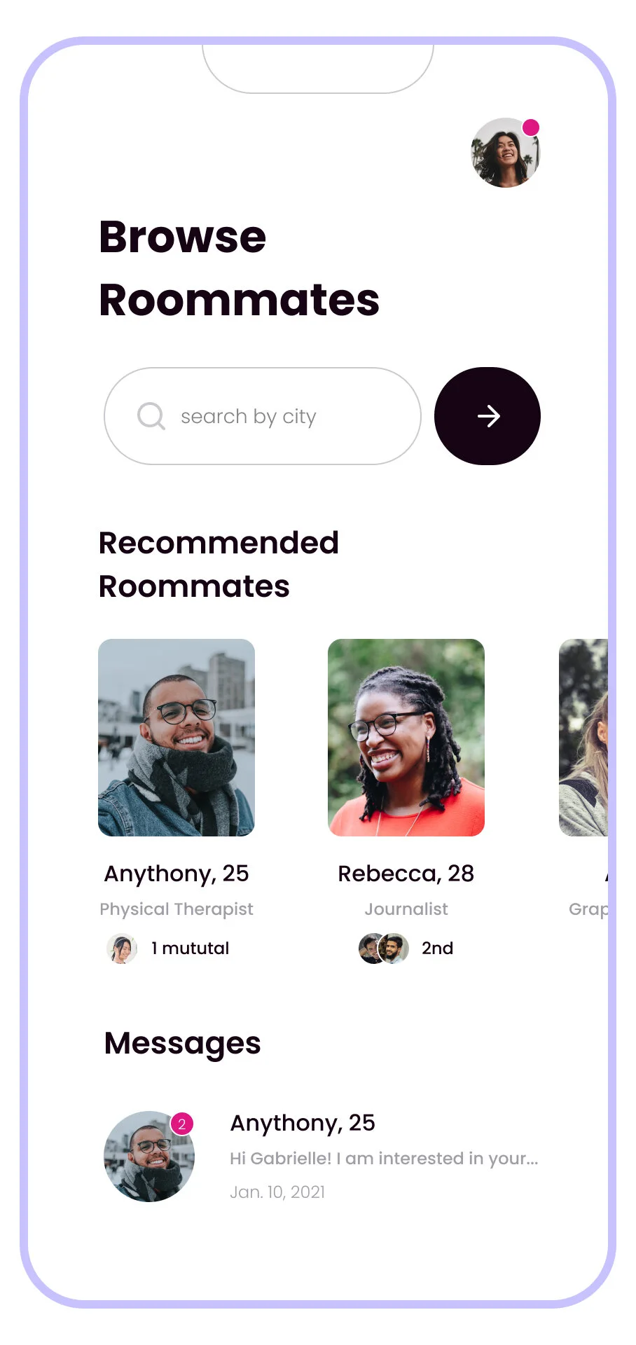
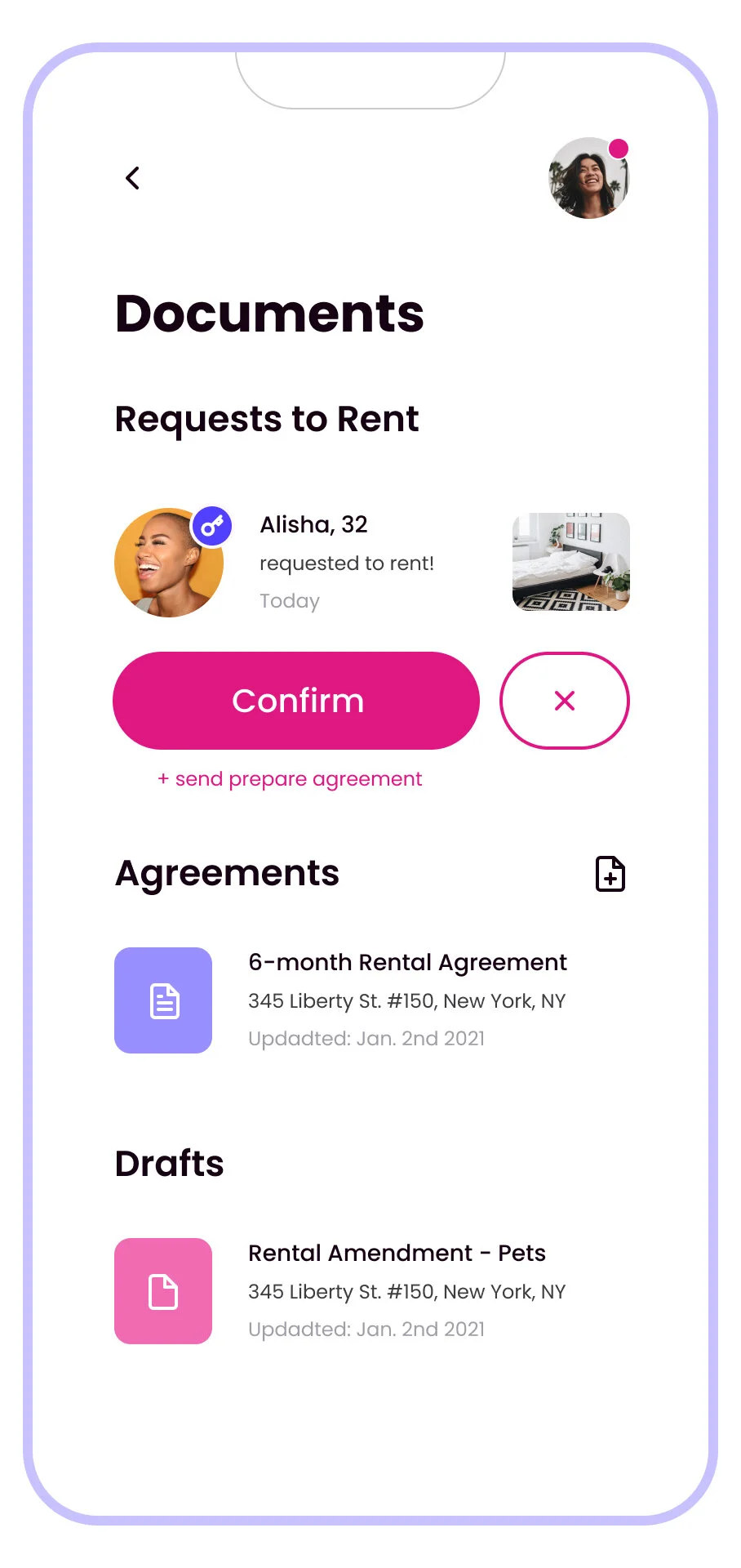
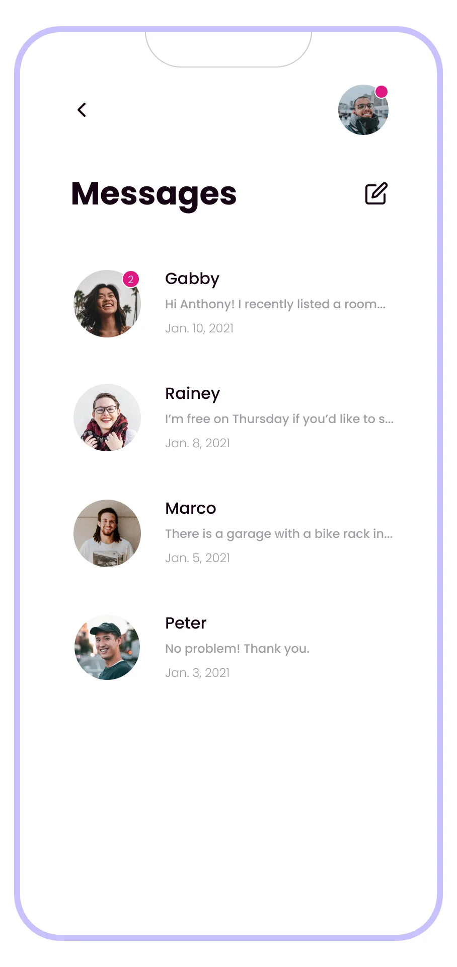
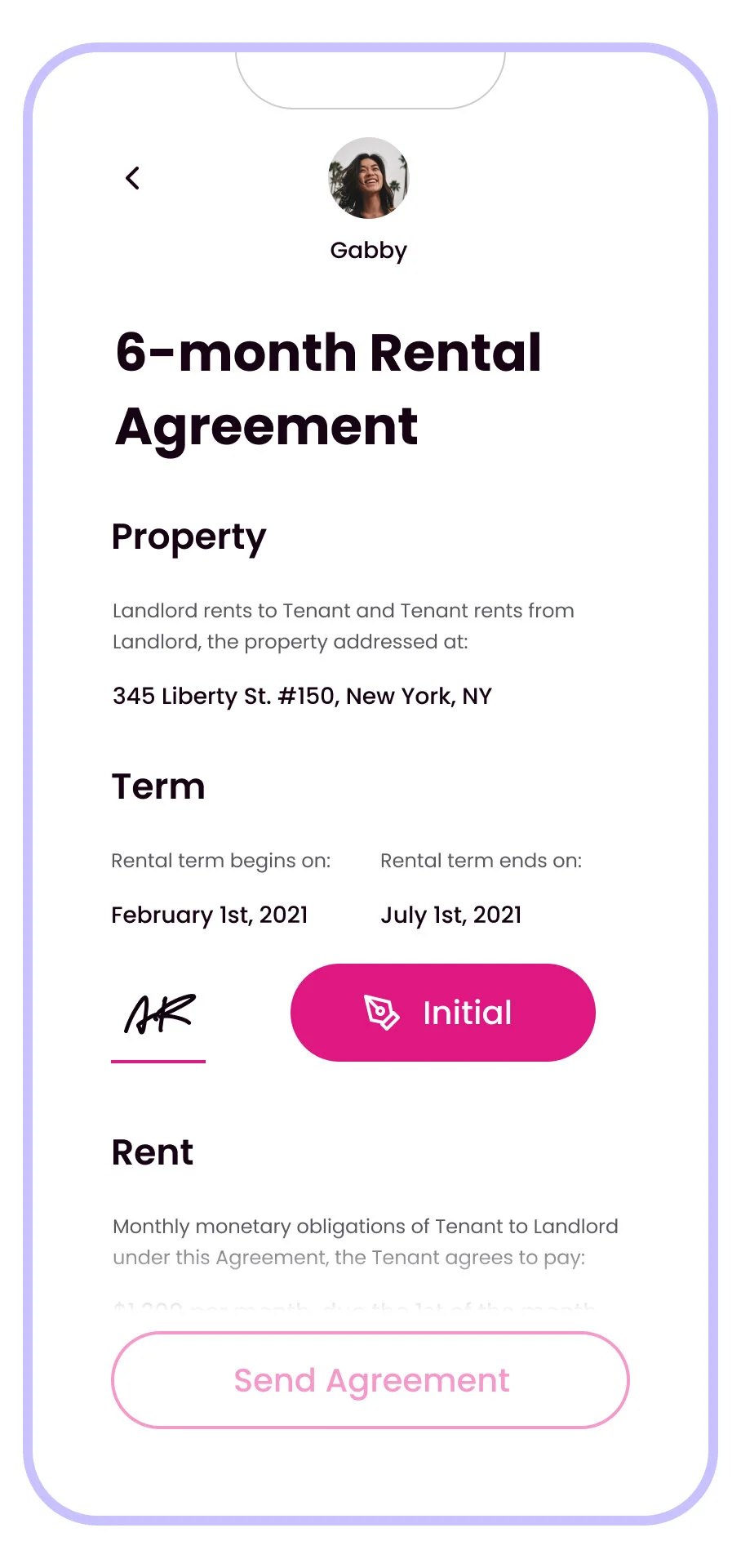
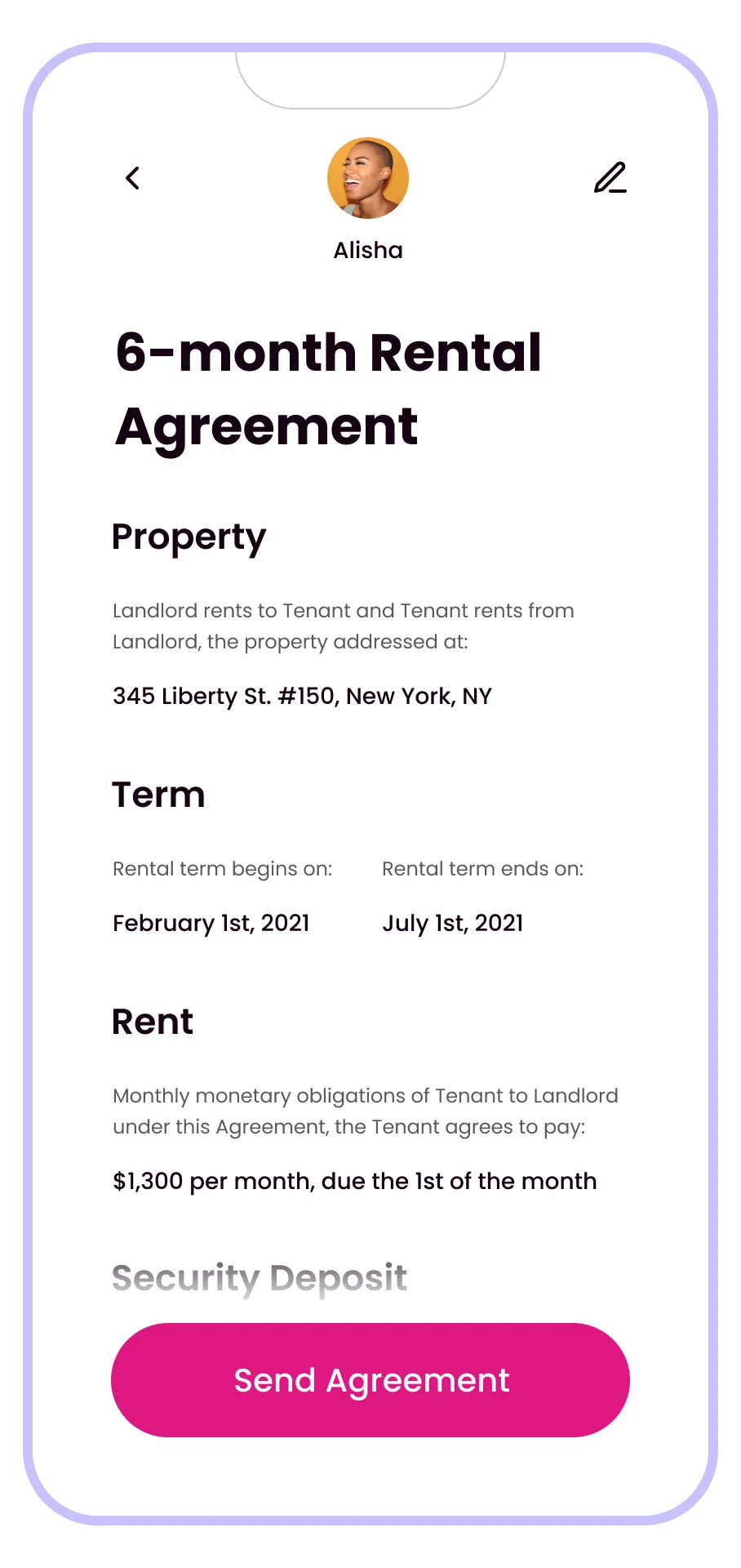
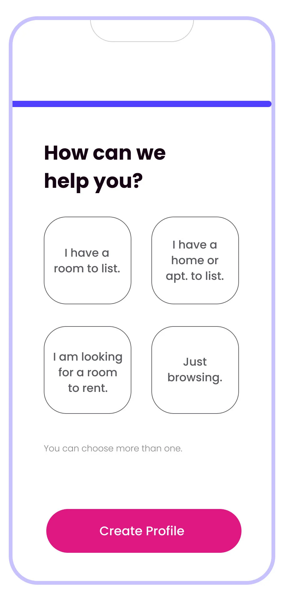
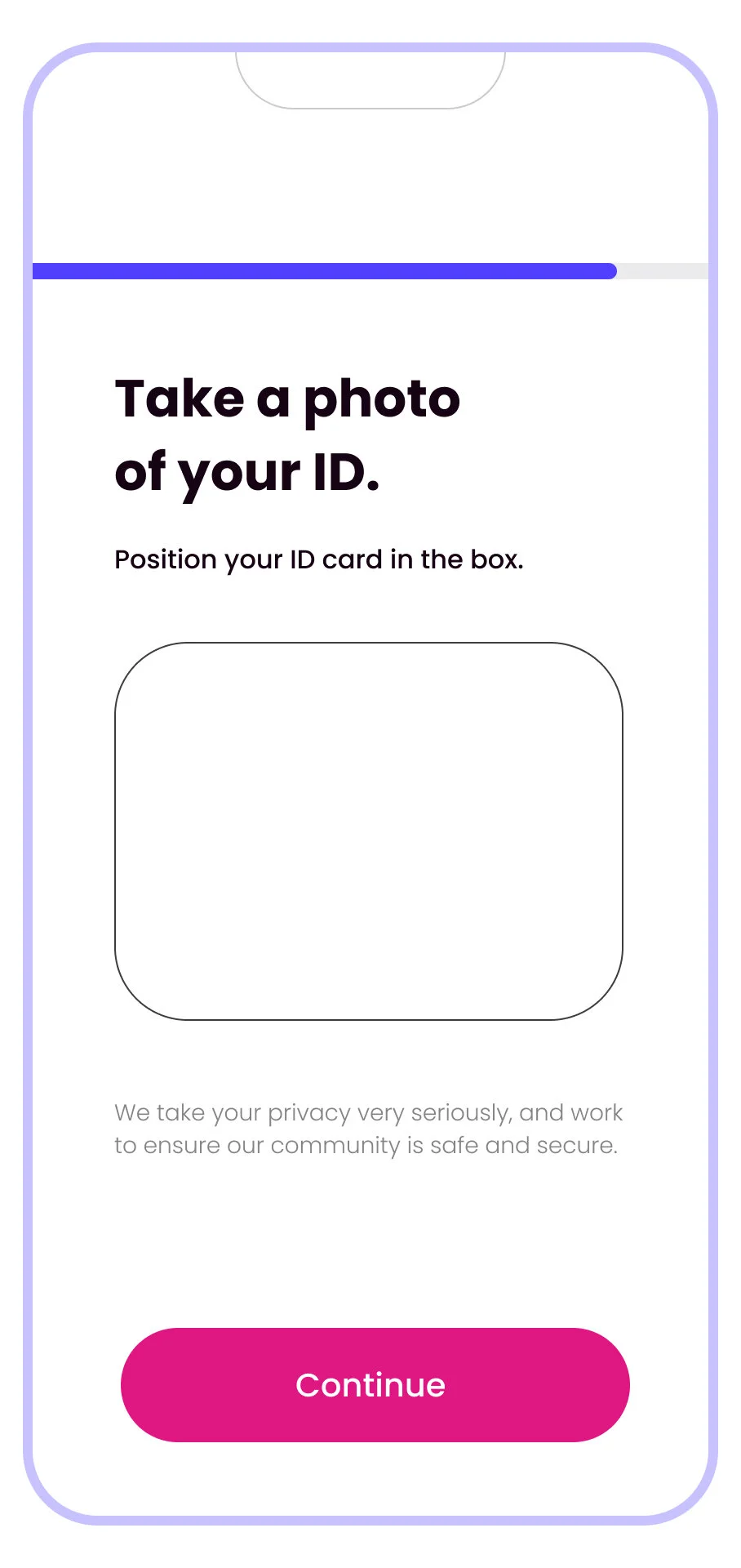
Working from sketches, I translated the rough ideas into wireframes and developed and organized the screens as needed.
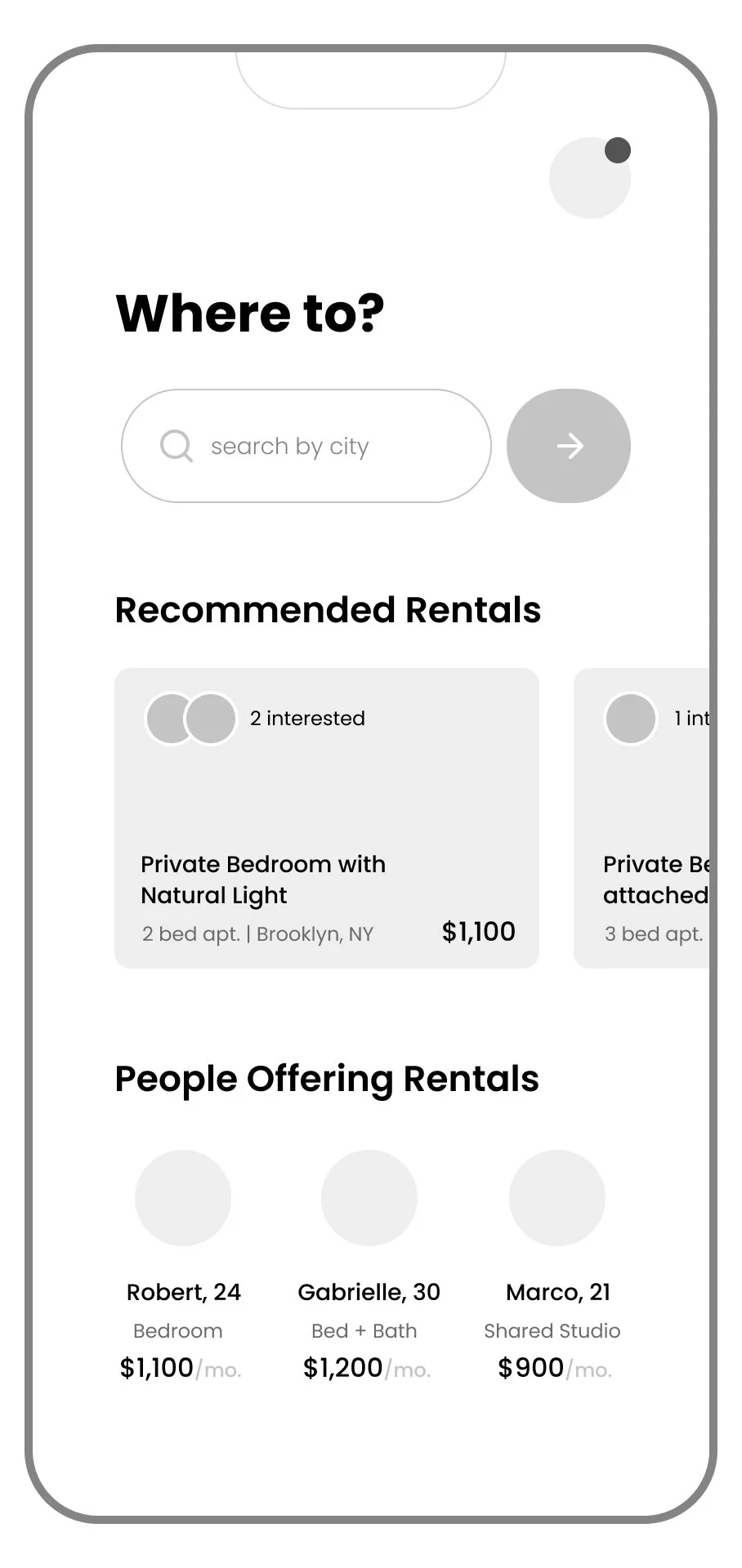
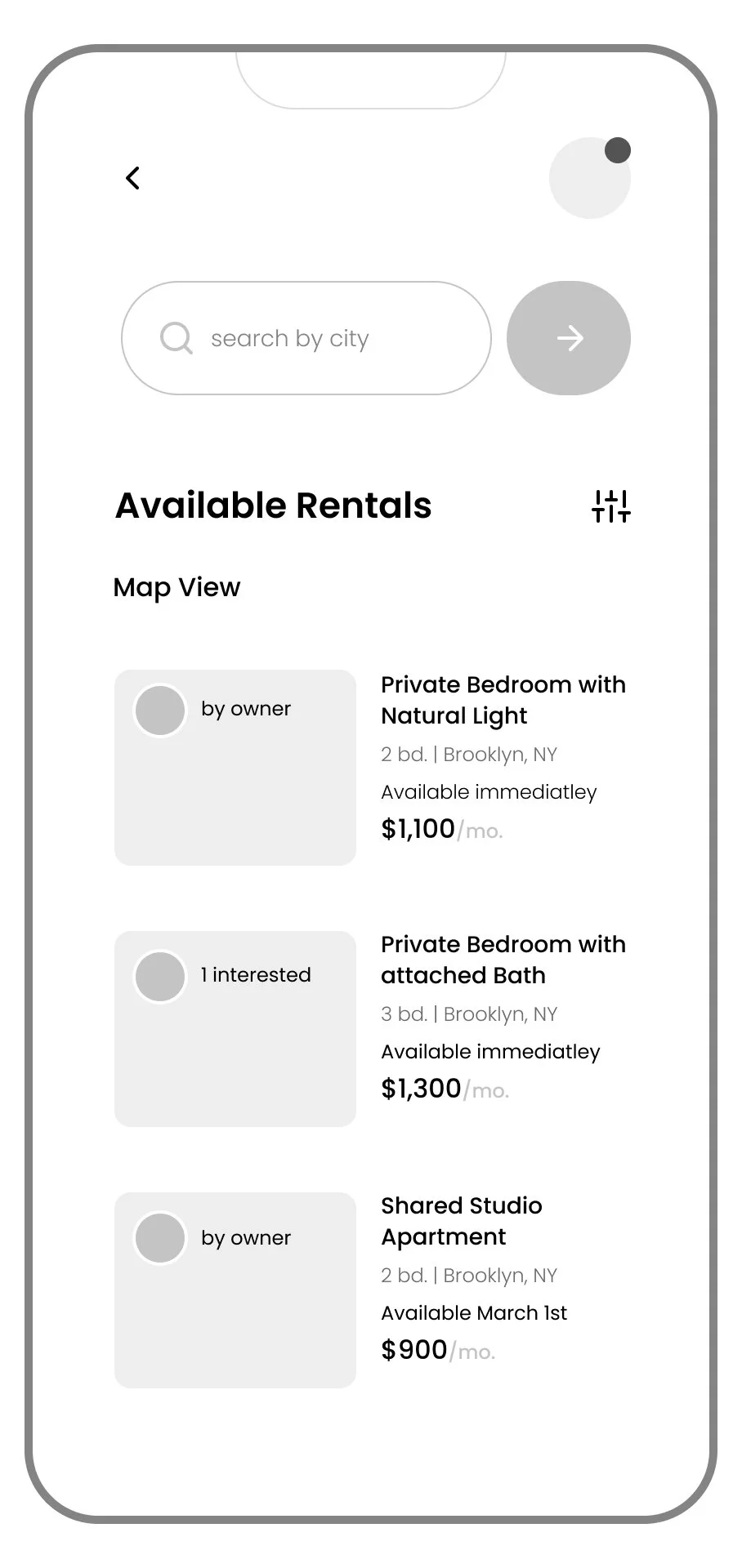
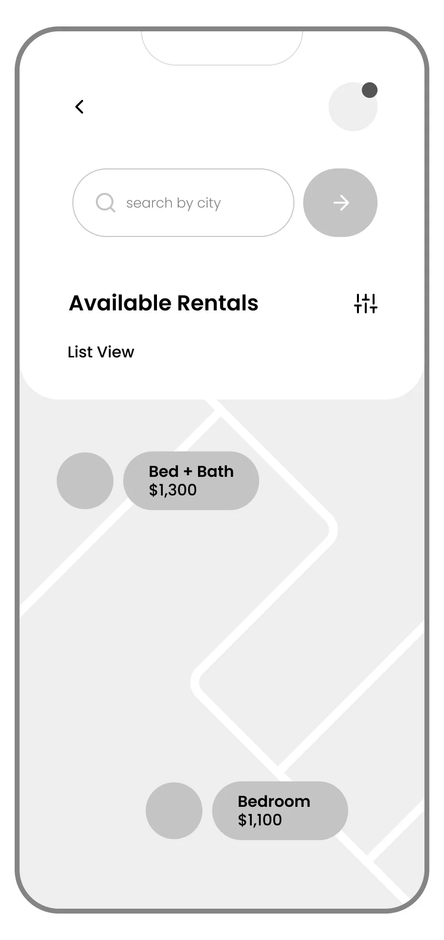
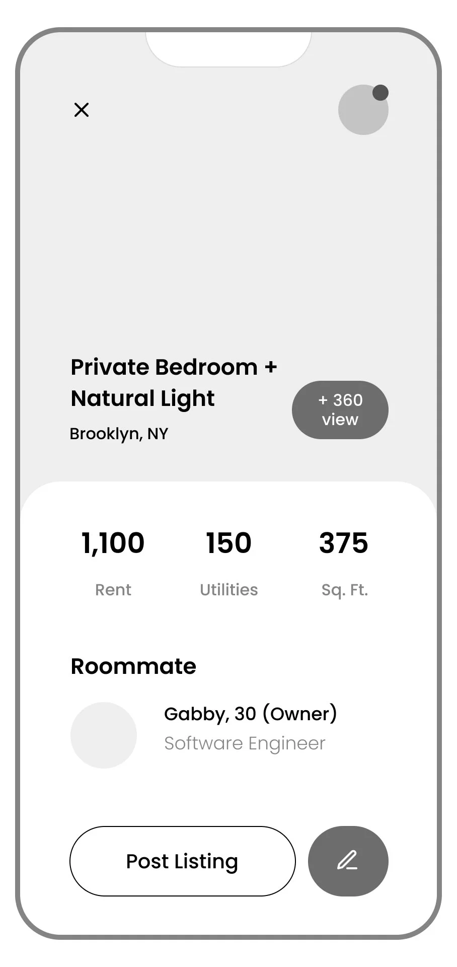
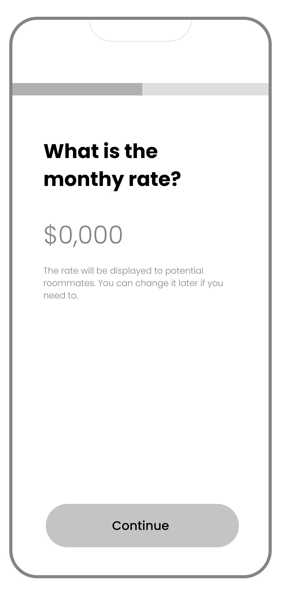
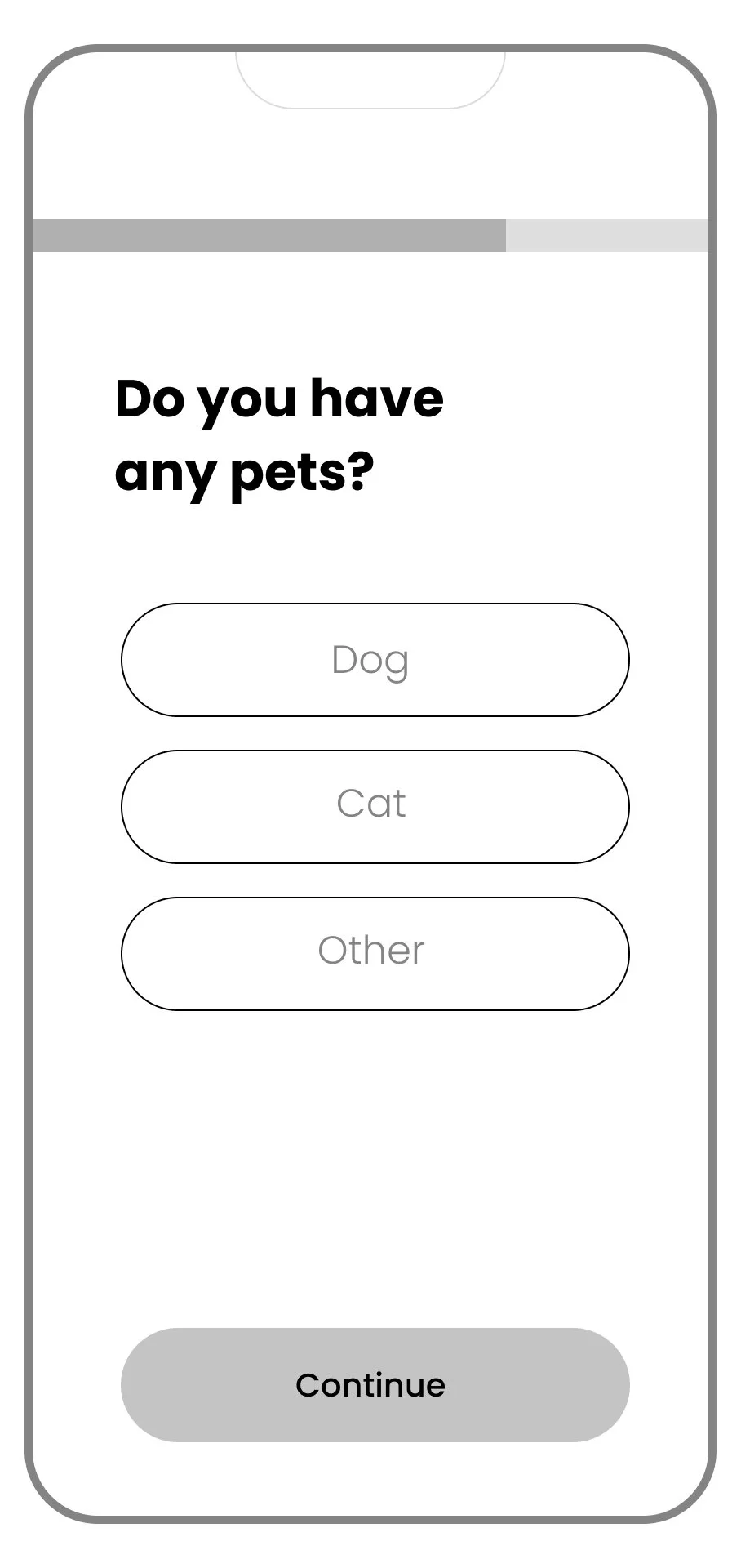
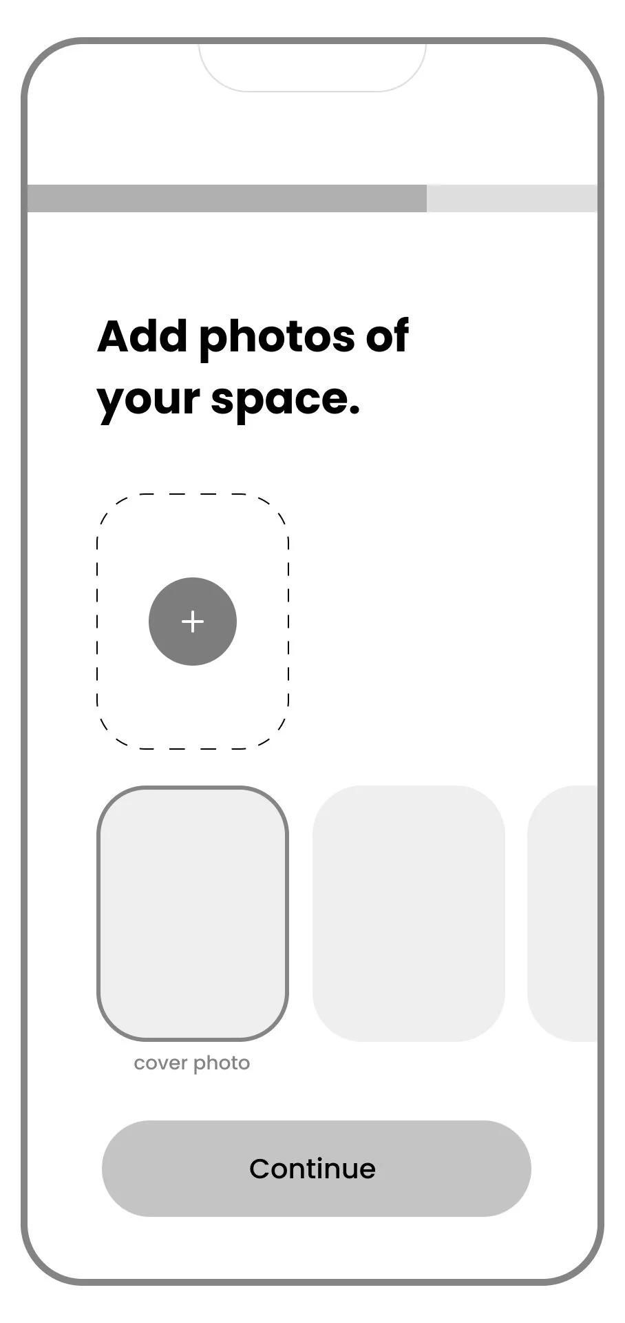
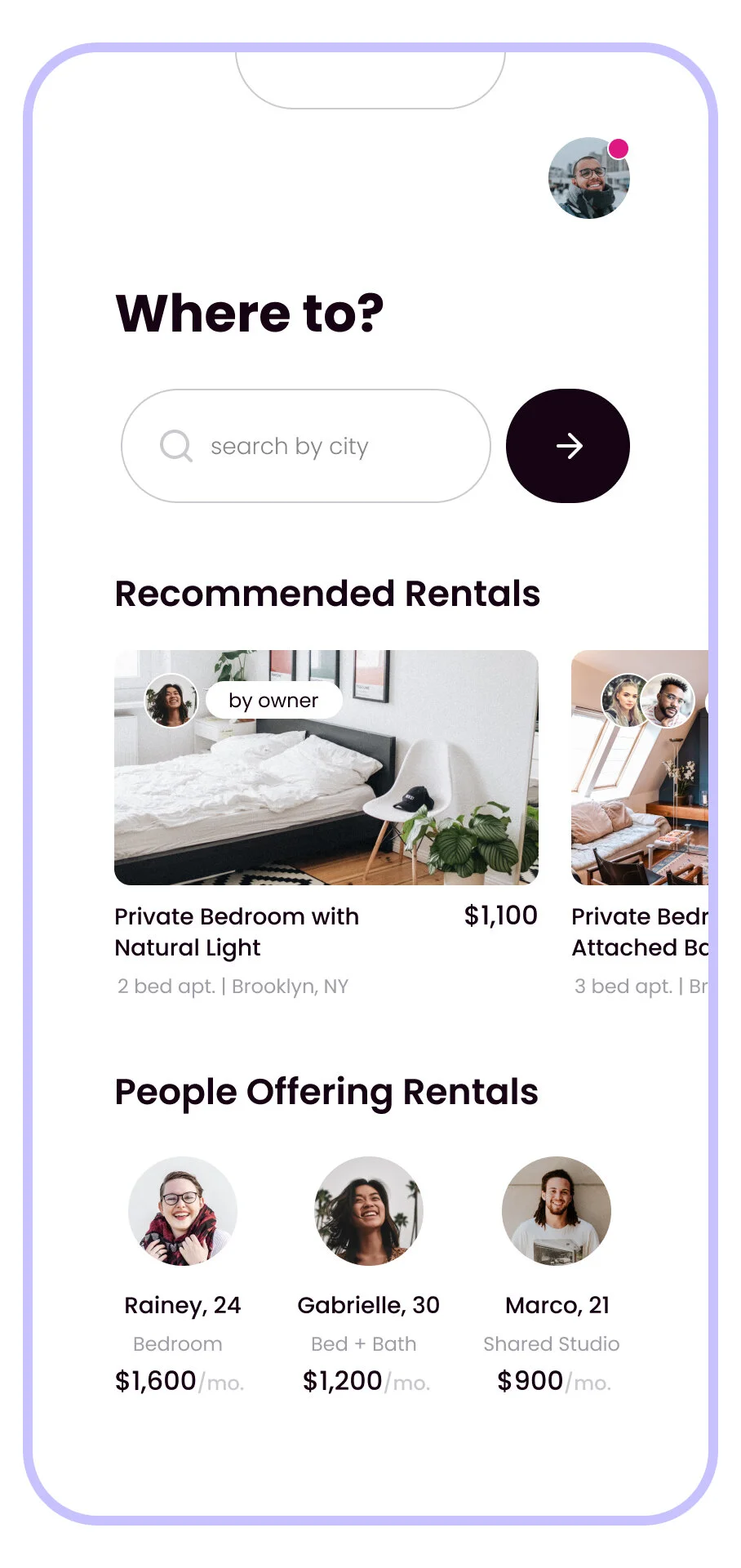
Key User Flows
I returned to the user flow map and aligned the screens to create flows demonstrating red routes starting at the Dashboard and progressing to sending and signing a Rental Agreement.
Renter Finds a Rental + Roommate:
User Flow (screens): zoom in and read in Figma
Lists Room, Finds a Roommate:
User Flow (screens): zoom in and read in Figma
User Finds a Rental + Roommate
View clickable prototype in Figma
*the prototype onboarding flow is simplified, see all onboarding + “create profile" / listing” screens in Figma.
User Lists Room, Finds a Roommate
View clickable prototype in Figma
*the prototype onboarding flow is simplified, see all onboarding + “create profile" / listing” screens in Figma.
DESIGN PROCESS | REFINE X2Feedback & Iteration
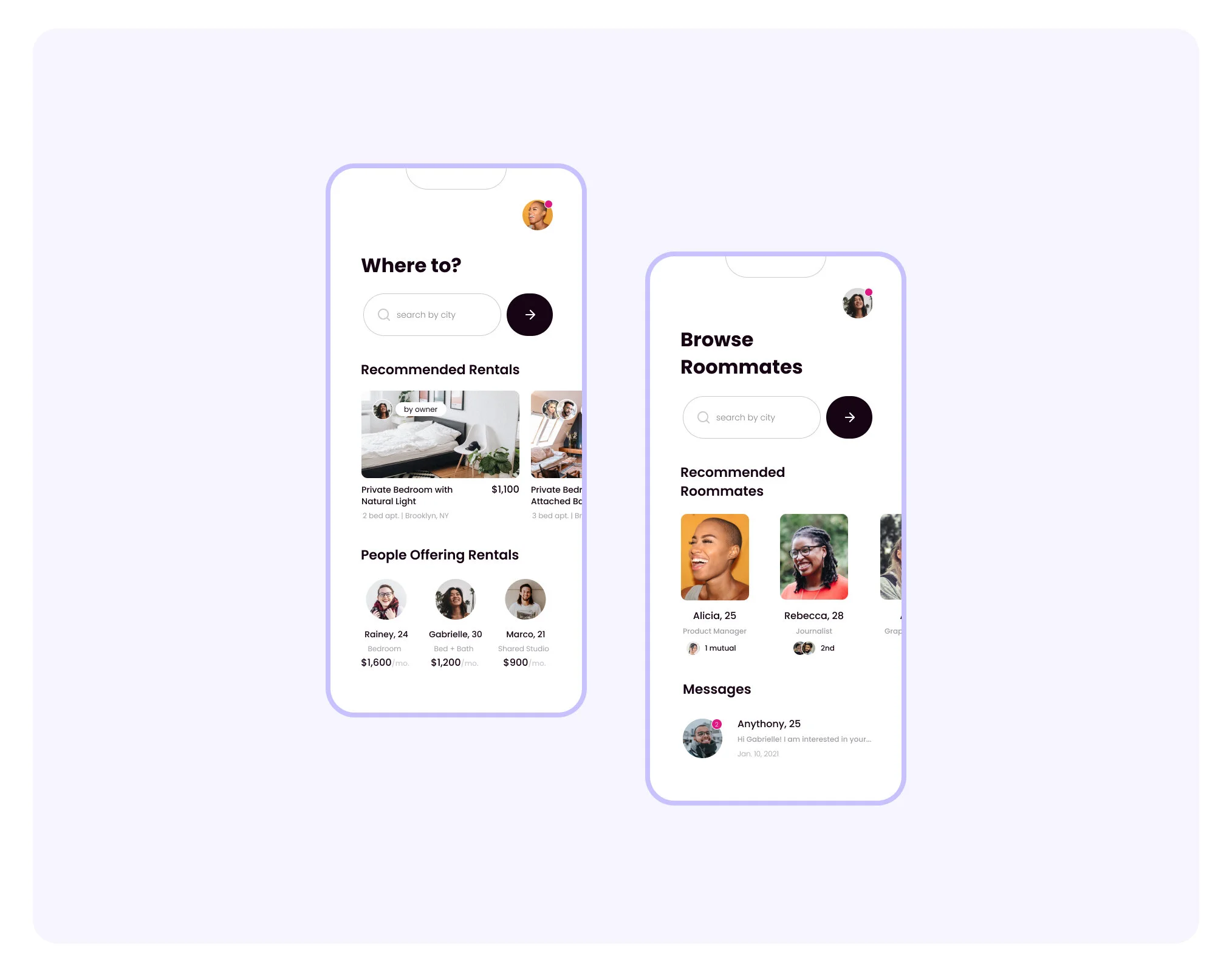
People-centric: Extend Social Presence
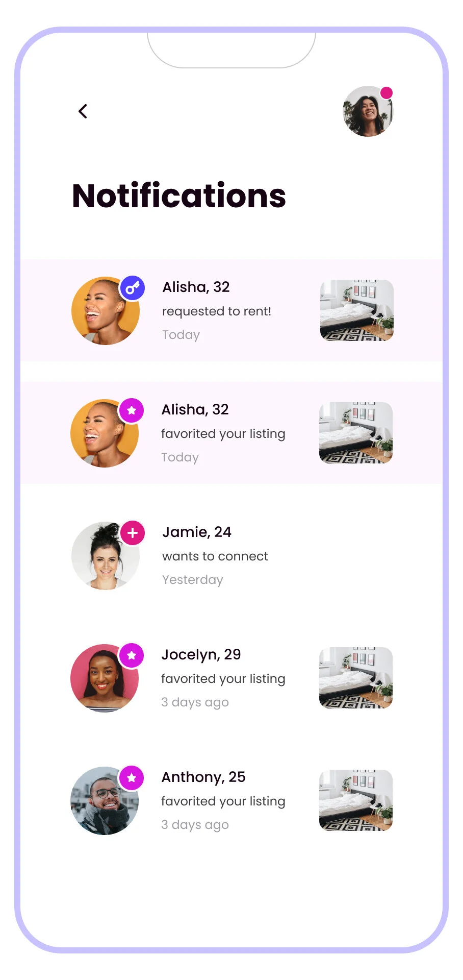
After passing the prototype off to two roommates to gather feedback, I needed to develop the social characteristics of the app. Users rely on references, mutual friends and word of mouth. Overall: someone vouching for a potential roommate goes a long way.
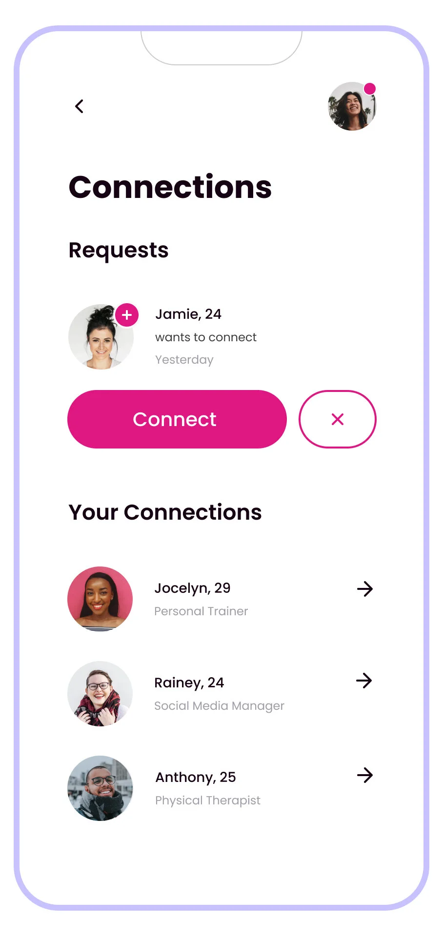
+ Endorsements, Facebook chips, 2nd-Degree Connections, and Connect Request flow.
The goal for this product is centered around people finding people.
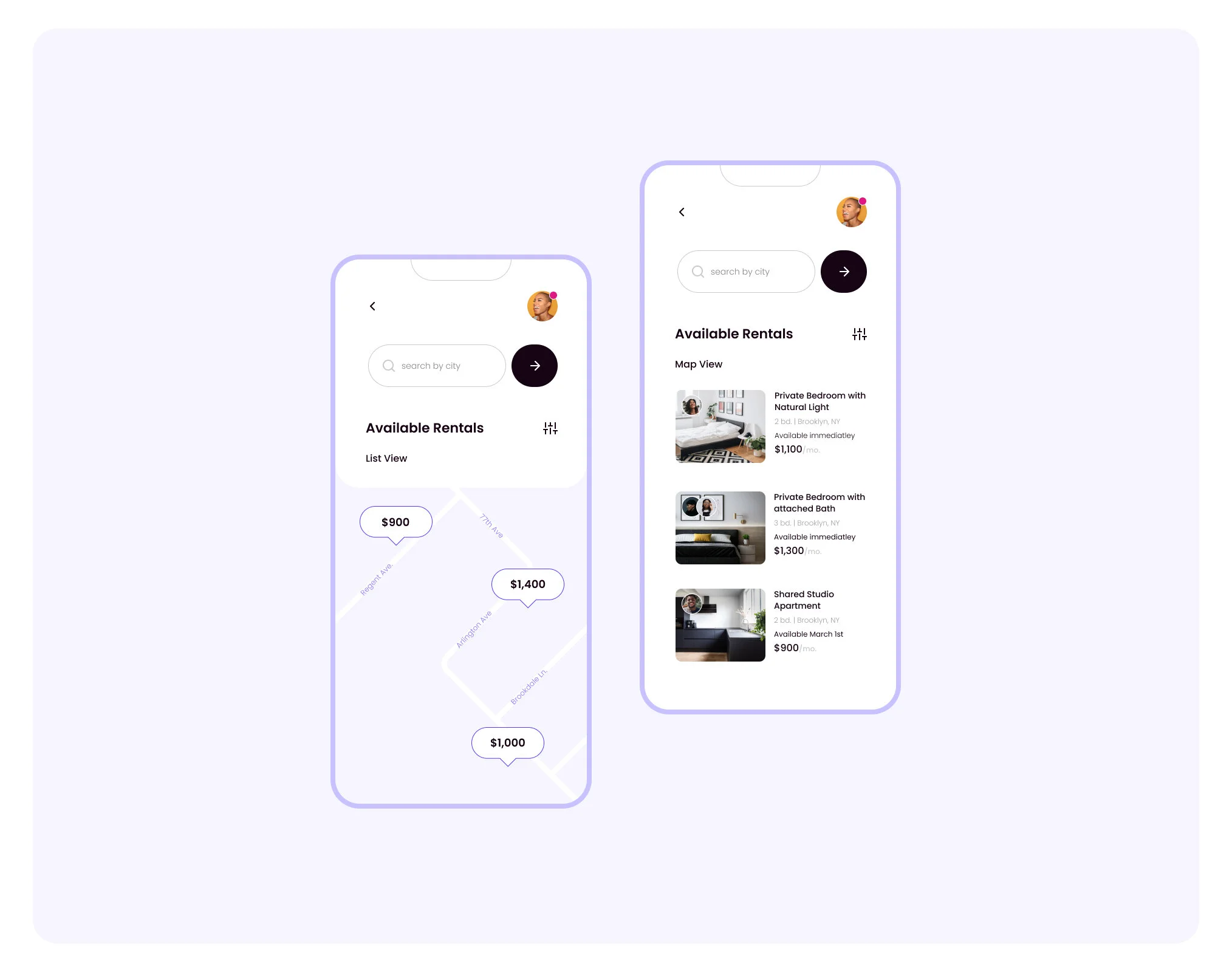
In the 2nd iteration, I focused on roommate profile states (not connected, requested, etc.), the UI of friend lists and containers, how to promote connections and how to endorse an existing connection.
What’s Next?
If I were to continue this project, I’d start with the following:
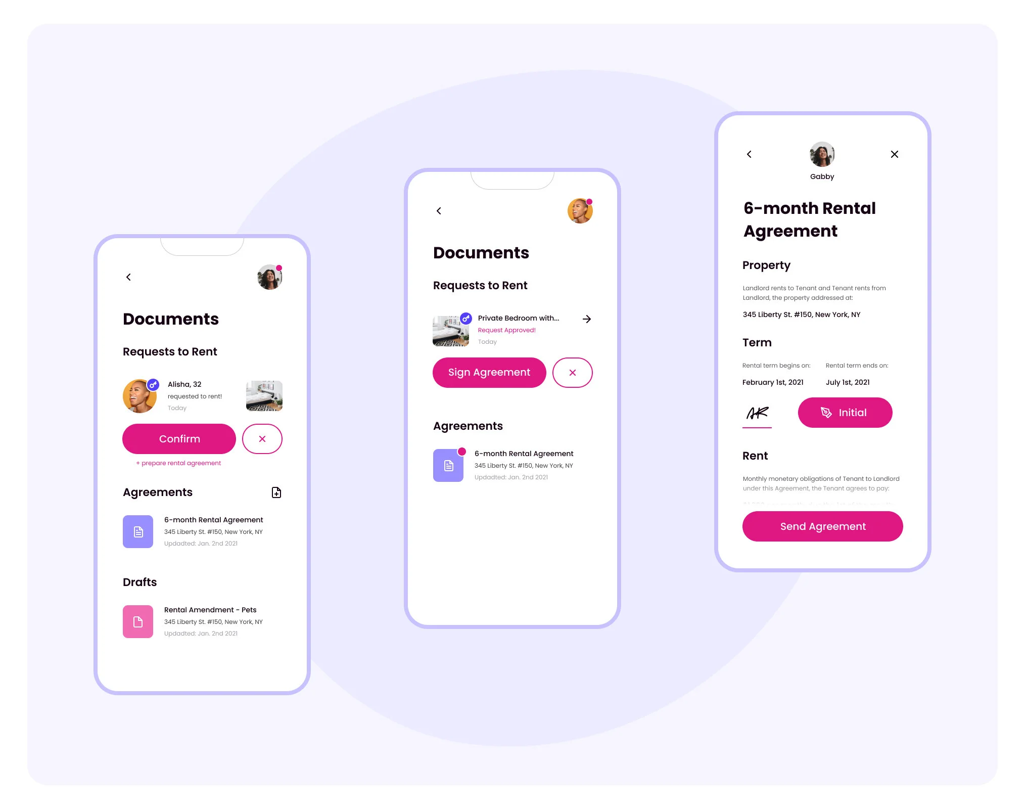
Develop Ideas: Form Flow for Drafting Agreements
My mother in law is a retired real estate broker who handed down a hard copy of a rental agreement for my reference.
For homeowners or co-renters, this type of language and paperwork is dense and overcomplicated, and not applicable to each rental. Creating a user-friendly, customizable form flow to publish a rental agreement would be a valuable feature.
Value: Creating user-friendly, custom, and plain-language contracts will decrease the potential of misunderstandings between new roommates.
Testing: Run Moderated Test with User Base
For this challenge, I was able to guerilla test some of the lucky friends and family in my home, but I would appreciate feedback from a more formal moderated testing session including task-based hurdles to test the integrity of user flows in conjunction with the current UI and navigation structure.
Value: Identifying critical or major issues in the current prototype before the next iteration or development.


